8 Simple ways to make your space interesting

Details in decor can make or break a design especially when you have a more minimal look (not a lot of stuff around).  You need something interesting  to draw the eye and provide a  momentary resting place.  It might be a texture, a beautifully shaped stool, or an embellishment.  A space without details is immensely boring and who wants a boring home?   Here are simple ways to add some pizazz to your space. Each  space will have a different starting point.


1. Use art  to create a vignette


art vignette yellow interesting space
Eye catching art anchors design

Choose eye catching art and use it to create a vignette.  In this space the yellow chair creates a visual flow from the artwork and it is anchored by the stripes in the rug. Books provide a casual look but other items could be added to the bench to continue the tone set by the art.

   2. Add pattern and texture

greek key pattern texture interesting space
Greek key detailing adds interest

The addition of pattern to any space instantly makes it more interesting .  Also consider using texture for a quiet way to add additional interest.

 3. Bring the outside in

wood stool bathroom interesting space
 Add outside materials inside


 Who wouldn't notice the natural wood element in this stool in a hard edged bathroom.  The repetition of natural shapes from outside to inside woks so well to move the eye to the welcoming outside view.

4. Layer furniture and accessories

bookcase wallpaper focal point interesting space
Patttern and colour with accessories create a complex focal point

 Some focal points are large and a room is created around them.  Other times a secondary focal point can be introduced in a quiet corner of a space. This solution works when there are several seating areas in one space. Layering furniture and accessories is one way to create interest.


5. Choose spectacular lighting

Tom Dixon lighting interesting space
 Spectacular Tom Dixon lighting


 Who could ignore the variety of shapes in these black pendants  that anchor the dining space in an open concept home? There are all kinds of lighting choices to adorn your space.  Find the one that is right for you.

6.  Use geometry

black white stripes hexagons gold  interesting space
 Black and white is always eye catching

When you combine several geometric shapes in one vignette, it can create a powerful focus.  When you add high contrast it is difficult to ignore.  Pop some gold into the combination and you have to look - more than once!


 7. Use common items in unique ways

starfish mirror interesting space
 A simple starfish repeated many times

Take one starfish and it has an interesting shape.  Repeat that shape many times by overlapping and you have a sculpture that begs to be looked at and touched.


8. Use pops of  warm colours

Red is an eye catcher

If you want instant attention choose red, yellow or orange as an accent.  Warm colours beg to be noticed by advancing visually in your space.

Now that was easy.  If you have a space you aren't pleased with perhaps one of these suggestions might help to create more visual interest. Do you have favourite ways to create interest in your home?

Leaning art: 4 Guidelines to make it work

Art warms a home, makes it interesting, provides topics for conversation and contemplation , adds colour,  the list goes on indefinitely.  There are various ways to display art; some are more successful than others.  One option is leaning  art against a wall rather than hanging it, but this display option isn't always successful for a variety of reasons.  If you want to try leaning art, consider the following factors.

1. Scale - Choose artwork large enough to read from standing or sitting  position


leaning art

 
 The size of a piece of art in comparison to the space and objects around it usually determines successful placement. This painting fits the bill perfectly.   

leaning black and white large scale art
 Large scale images work best

source
When you want to lean work on the floor it needs to be large enough to observe from standing position and bold in imagery so it can be read at a distance. Even the dog get this!
 The photo on the right works better than the  the art to the left of it because the image is tiny. 


large leaning abstract art dining room

Perfect scale and beautiful work that can still be seen and read while sitting or from other areas of the room. 

simple black and white composition leaning art
Bold form and simple composition

source
The boldness and simplicity of this painting  make viewing it easier when leaned on the floor.  The objects in front of it enhance the placement and help to anchor it safely. They do not interfere with the reading of the image. Which leads to the next guideline...

2. Layering: Don't cover major parts of an artwork

abstract leaning art with chair
Successful layering

source
Layering other objects in front of an artwork is a tricky business.  This vignette is successful because the image is large, dark and has quite a bit of space where there are no details.  The chair and table lie in areas without too much detail.  You don't feel as if you are missing  important elements of the work. 

large leaning artwork behind table
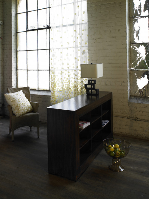
Do you want to remove anything here?

source
There are so many things about this vignette I love, but I want to see all of the artwork and part is hidden by the table and books.  Even removing the books would help things considerably.   Love the candlesticks and the table, both really work with the artwork.


leaning art on mantle
Successful layering where each image is clearly seen.

source
 Layering art on shelves, consoles, and mantles can be very interesting. It is a way to display smaller pieces  to good advantage.  While this is a very simple vignette with the branch acting as a consolidating element, it is possible to have more complex collections of objects.

3. Colour scheme:  Restrict colour combinations in  leaning gallery display

 
gallery wall limited colour scheme
Limited colour scheme provides cohesion

 There are lots of small pieces in this display but they read as one unit because of the colour cohesiveness.

4. Image: Choose the right image for the space

red airplane leaning art
Art with simple bold form


I think the work that layers best in a vignette has bold form and colour.  It can compete with the other objects for your viewing attention.


Now it's your turn.  What do you think of this arrangement?

 framed art leaning


Antlers: Trend or timeless?

Looking at a variety of  recent design sources supports the view that antlers are a huge style statement.    While always part of rustic country design, antlers and antler motifs seem to have crossed all design boundaries to the point where you see them everywhere. 

antlers modern lighting fixture
Spectacular lighting from Yellow Goat Custom Lighting
Right now I have reached the saturation point, and whenever I see antlers my reaction is usually utter boredom. Hopefully I will recover  because I love their sculptural  form and representation of  the passage of time and natural cycles.  I draw the line at their trophy history- no mounted heads for me.

antlers in the sun
 Moose antlers aging in the sun

 source
Several years ago my friend found a lovely pair of moose antlers in the woods near my summer house and dragged them home for me. They are still weathering to a lovely grayish white. While I was excited initially with this gift, I am reticent to jump on the antler bandwagon.  If I wait long enough the trend will pass, like all trends, and antlers will be new again. 

I guess you could say I am very fussy about how they are used in decor.  I think the trick is to mix them with other objects  in simple vignettes  with a natural focus where their sculptural qualities can shine and direct the collected composition. In this  understated way they will always be timeless. So here are my four ways to use antlers for a fresh look.

 As a sculptural element


white antlers  white table vignette
White on white accentuates antlers sculptural quality
source


These antlers are the perfect shape to use with the other elements in this vignette. They mimic  the branches and provide an interesting backdrop for the cylindrical shapes. 

antlers fireplace vignette
Simple arrangements  allow the form to show
What could be more interesting than branching shapes against a dark base?  Less is always more. 


As a design anchor

antlers candles vignette
Antlers and candles in a vignette


There's no doubt that the branching quality of antlers makes them a perfect form to arrange objects along an interesting line.There are all sort of images online with candles interspersed among antlers. You could also use small groupings of wildflowers instead of candles.

As a pivot point

Adding interesting lines in a vignette

Who knew that antlers can actually add a note of elegance when combined with equally elegant objects?  They are great for moving your eye around in different directions encouraging you to take in all elements of a vignette.

As functional objects 

antlers white candleholders
Antler candleholders

These are truly exquisite and would look good anywhere.

Add to planters

Antlers would make a great natural additions to a planter when you have vines or other plants that will grow along a shape.

What's  your take on antlers?  Do you have any in your decor?


Feeling red

I'm a firm believer that colour provides us with certain benefits at certain times and  I take note when I find myself attracted to a certain colour.  My past loves have been black, green and purple.   All of a sudden I am hugely attracted tored  and I want it around me in my home.  This is a first for me.


red accessories
Red accessories

I catch myself looking at red things on Pinterest and Olioboard. 


I want to hang up one of my red paintings.
 
 meaning red poppy art Margaret Ryall
Evoked, 2013, Margaret Ryall, encaustic
 “Painters use red like spice.” — Derek Jarman.....  If so this is one hot painting.

 Why red now?

 From yoga I know that red  is the color for the base or root chakra located at the base of the spine; this chakra allows us to be grounded and connected to universal energies.

Red also affects us physically.  It is stimulating and boosts our physical energy levels, increases enthusiasm, action and confidence, and provides a sense of protection from anxiety and fear. Don't forget that red relates to physical desire in all its forms- sexual, appetite and cravings. Pretty powerful stuff. Who wouldn't want a dose of red around with all those benefits?

I've written about red before so this must not be a new thing.  Check this  post .

I must need a boost of red.  I'm listening.  How will it play out in my space? 

 Is red a part of your home decor?

Blogger App

Yes, there is an App for Blogger and here I am trying it out.  In the past I've wanted to compose posts on my I Pad when I was travelling and couldn't.  Last week I saw an ad and decided to give it a try.  This is an in process review.

So far so good. The interface is simple , but so are the text options. 

 Can't do much that is fancy with just Bold and Italics and underline.  Also clumsy when you have to select and apply these options.  Not to mention how I hate one finger pecking to compose!

Let's try adding a photo from my camera roll.  You  have some options for photos with screen shots, actual photos taken with I Pad or downloaded  from camera.


When you read the reviews they are less than stellar with a long list of complaints.  My take: Can't include video or links, can't add photo captions or photo properties.  Nowhere to add label tags. So much for basic SEO.  

So..... Good for a short, simple post with photos while you are on the fly.  I am wondering if I can go back in on my computer and add captions, tags etc. after the fact.  Now to post this....   The only thing I see is Done.  Here goes.  New comment....  You can add labels and go back to the text. Let's try again.


Addendum.
Published easily and you can go back and edit online after the fact to change things a bit e.g. Size of photo, add captions and properties. 

Design Love: Kubus

One of my favourite Scandinavian designers is Danish architect Mogens Lassen (1901-1987).  I am now the proud owner of one of his designs - Kubus 4.  Thank you family; I've had a love affair with this candleholder for years. 

Kubus 4 Lassen accessories
Kubus 4 candleholder in my living room
 I've begun to think up all the things I can do with this beauty, as well as  sizing up the various spots that are crying out for its presence. Its colour and bold form is not easily ignored.  I love the large space in the cube beneath the candles because it allows you to add additional objects to create lovely vignettes. Right now I have my bird bowl by local potter, Erin McArthur.

Kubus 4 adventh wreath
 Idea for next year- advent wreath
 
by Lassen is a family business whose simple mission is to carry the Lassen legacy forward - because good design lives on through new generations. Here are some of the products available today.

Kubus 8, Kubus 4 and Kubus bowl


Kubus 1 has its own design potential

Kubus bowl in beige 


Kubus white with flowers Klassen
Kubus in white with mounded roses
  source
The Kubus Bowl was inspired by the Kubus 4 candleholder. This design is available in several colours, and the design potential is limitless.  You can add a range of things to it:  snacks, plants, flowers, ornaments etc.and/or add new elements under it to create a vignette. Of course it is a beautiful sculpture all on its own. 
kubus 4 copper vignette Lassen
Kubus 4 vignette
source
If you want to have a little Kubus treasure hunt check out  my  recent post on  Scandinavian Design  Elements.  There's one hiding.


A difficult good-bye

I've wrapped up the Christmas season in different ways, but 2013 will stand out as a doozie in my memories. In Newfoundland the season is "officially" over on January 6- Old Christmas Day - when most people begin to think about taking down decorations. 

Simple Christmas decorating
 Family room looking festive at night  with magnolia and wreaths
  The season was chugging along quite nicely until  January 2nd. when everything fell apart because of extremely low temps, a snowstorm, and then massive power outages prefaced and preceded by rotating outages to conserve.  Needless to say that is a recipe for all kinds of problems including broken water pipes.  I've been learning the not so pleasant ways of insurance companies ever since. Enough said!  Living in a bit of a disaster zone with ceilings ripped out, dehumidifiers and air blowers going, plumbers and carpenters banging and dragging materials through the house, etc. is not my idea of perfect harmony.

It was like Christmas dribbled away without our noticing it.  Couldn't turn on the Christmas tree or the outside lights, couldn't entertain unless you wore your long johns, brought a flashlight and served melted snow. Much was reported on Twitter about the events, and I particularly enjoyed two blogposts by Heidi Wicks that are definitely worth a read.  I love her humorous take on the everyday. True and funny.

In the midst of construction I removed my Christmas decorations and looked for inspiration for next year.  

A nature inspired theme perhaps

My love of birds takes many forms and I have a friend who gives me one each Christmas.  I think next year I will pool them together and see what I can come up with.

Simple Christmas decorating birds
Birds and dragonfly

silver pinecones ornaments birds simple Christmas decorations
 A winter display
 I can't bear to put it all away, so I find little ways to add sparkle and colour to the winter months.
Accessories white and red poppy birds
Poppy with birds
And finally my little spot of red. Good- bye Christmas 2013.


Current trends in window treatments


 So what are the  current trends in window treatments?  The key words are simplicity and minimalism with an emphasis on crisp, clean lines. Gone are the days of heavy draped effects using jabots and swags; tab curtains or gathered valances. If you are wondering if  any type of valances are still in style this post will answer the question. 

Not a lot has changed since I wrote this post in early 2012.  Because it is so popular with my readers I thought I would add updates that reflect 2014 choices.  You might also like to check out Choosing Drapery Hardware.

 Layering

While layering is  popular, the overall look remains clean and the palette is usually consistent for both treatments.  Blending colours rather than contrasting ones work best when you want to layer treatments. Any type of blind can be used under drapes for a layered look.


window treatments layering drapes woven wood blinds
Layering drapes over woven blinds
window treatments layering drapes Roman shade
Layering drapes and Roman shade in bay window

 This is an interesting look with drapes and two romans with the outer printed one stationary  I suspect. I am not a lover of the partial rod because it creates a chopped look and I never choose dark rods with light drapes because the rod becomes the dominant feature as it is above. You can purchase rods with elbows that allow you to span the width of a bay window. This is a much more finished look.


Pattern is hot
When you look through new fabrics you are bound to notice that textures and patterns abound. You can't go wrong with geometric patterns, trellis designs, large scale florals, bold colours, whimsical motifs etc.


window treatments geometric designs drapes
Geometric designs are always popular

window treatments striped valances drapes
Stripes never go out of style
window treatements drapes floral trends
Floral patterns on light backgrounds are very popular

Banding
Vertical or horizontal banding is very popular and adds beautiful detailing and interest to any plain drape. You can add banding to good advantage if you want to add visual height or width to a space.

 
window treatments vertical banding
Vertical banding to match duvet

window treatments drapes with banding
 Horizontal banding

Wider drapes

window treatments drapes 2014
Visual width added by mounting drapes beyond the window frame

 Overall, drapes are  getting longer and wider to accommodate the trend to make windows appear larger in scale which is a trending look right now.  Lush materials like velvet and silk add to this look.

Tone on tone
The window treatments in the room below are simple, harmonious with the walls, and allow the view and the room to shine.  When deciding the colour of your drapes you should first consider the look/feel you want in your space.  If you want restful, choose solid colour with texture and keep to the colour tones in the room.


 window treatments tone on tone drapes
 Tone on tone draperies  for a restful look

Longer, looser pleats (5-6 inches)
While on a recent trip to Europe I noticed that pleats are getting softer and longer to provide a more contemporary and less formal feel in a room. There are many different headings to choose from to get the look you want .

window treatments  6 inch pinch pleat
Longer pinch pleat
You can't beat pinch pleated drapes.  They continue to be the industry standard for elegance. Pinch-pleated drapes characteristically retain their shape, maintaining a consistent appearance opened or closed and hang beautifully. 

window treatments long loose pencil pleat
Long looser pencil pleat

Long inverted (back) pleat


Cleaner look in headings

 
The inverted  box pleat (back pleat), my personal favourite,  is a soft but tailored look for modern decor.  It has been replacing pinch pleat styles when a more clean contemporary feel is required. Lighter colours and tone on tone add  softness to home decor.

window treatments inverted back pleat
Inverted back pleat is contemporary and tidy

Grommets have been around for  a number of  years and are definitely  still in vogue.  While some grommet drapes can look very informal, it is possible to have a more styled look too.  The banded grommets below are a great example.

 For grommets to look "lush" you need at least 7 or 8 folds at the top.  That means purchasing two sets of ready made panels or have custom fully closing ones. .If you plan to open and close grommet panels daily be warned that you will spend a lot of time fiddling to adjust them so they hang nicely. 

livingroom contemporary kids

Updated Sheers
Yes, sheers are still popular but they are a world away from the fussy, frilly and lacy ones that the word sheer brings to mind. The "new" sheers have subtle iridescence and are interwoven with unexpected materials, or have embossed or printed patterns or contemporary headings as in the room below.

window treatments contemporary sheers
Contemporary look in sheers

Houzz 

Layered drapes over sheers with contemporary headings are still popular

Global Living / Bluefish Home - Showroom eclectic living room
Printed/textured sheers add interesting light play
Global Living


Roman Shades
Roman shades continue as a  favourite for contemporary homes.   Who can resist their clean lines and  the options for amazing patterns?  Because they are a flat construction the fabric needed is much less than full drapes.  This allows you to upscale your fabric choice and make a real statement.  I can't say enough about Roman shades because they are my personal favourite.  Their flat surfaces are almost picture like and work especially well in kitchens, eating areas and bathrooms.

window treatments Roman shade valance
Roman shade with valance
House Beautiful

window treatments Roman shades patio door
 A bold patterned Roman on patio doors
 Houzz

A more traditional Roman with banding
source 

Metal Blinds Return
Who thought we would see a resurgence in metal  blinds?  It's begun and is driven by the popularity of stainless appliances, other metals especially bronze in  and  industrial style loft living.

window treatments metal blinds
Metal blinds for lofts and contemporary spaces

Woven Wood Shades
The trend to more eco-friendly materials has prodded this design aesthetic along. most are made from sustainable materials including: grasses, sisal, reeds or  bamboo. 


 Woven wood blinds come in many colours 


Cellular shades
window treatments cellular shades
Cellular shades offer great versatility


Cellular shades are one of the most versatile window treatments available today.  They can be hung by themselves for a very contemporary look or layered with other treatments and provide additional insulation for your windows.  Options for cordless, corded, remote and top down/bottom up round out this very popular window treatment.

Powered by Blogger.