New growth always brings with it hope and energy for life. Once the snow goes I always get a hankering to make changes inside my home. Now don't get me wrong, these aren't major changes. I'm more into ten minute additions. Sometimes I'm willing to commit an hour or two to a special project.
If you get the spring hankerings perhaps there's inspiration in these ideas.

Perhaps you have a blaw wooden tray you could spray paint and then organize a colourful spring vignette in it. Think about what you might already have to add and then buy several filler items.

A small tray on a bathroom counter adds a fresh look. Placing a grouping of cut flowers always adds to any vignette.

I particularly love groupings of white and muted colours and then a big splash of colour with cut flowers. Yes, my biases are showing. Fresh flowers rule in my life.

Tall glass vases allow you to see the roots growing . You have to be on top of the watering if you are going to adopt this idea. Repetition of the same shape always looks good in an arrangement.

This simple twig wreath adds additional detail and texture and also helps to cover the pot the bulbs are set in.
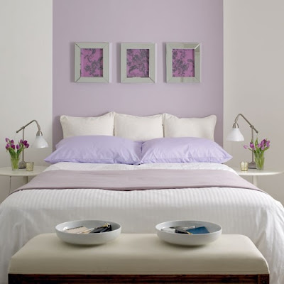 You don't have to repaint a whole room. There are so many simple painting projects for your home. If you have a bed perfectly centred on a wall, consider adding a painted headboard all the way to the ceiling. Simple and very eye catching.

Bring a simple bookcase to life by repainting the back of it. A fresh colour like this yellow (which is a hot 2013 spring colour) adds a simple focal point and shows up the grouping of objects and books .

I love highlighting a porch or entry door with paint. You can be brave in your colour choice when you want to add a cheery accent to a small space.

Coloured islands with light cabinets are everywhere lately. This is such a fresh look if you have enough nerve to go there.

Not artistic? Don't worry. Choose sculptural artificial flowers and lay them on a canvas painted in a solid colour. Trace around the shapes with a white coloured pencil . Fill in the shapes with white paint. Presto! Fresh art for your wall. The simplicity and off center composition of this work makes it.


Textured wallpaper is underutilized. There are so many patters and textures that cover the gamut from very traditional to modern. No doubt there's something for you. I like the use of textures to reinforce a dresser make over. This is a great idea for a little girl's room.
If you get the spring hankerings perhaps there's inspiration in these ideas.
Use a tray to organize a vignette

Perhaps you have a blaw wooden tray you could spray paint and then organize a colourful spring vignette in it. Think about what you might already have to add and then buy several filler items.

A small tray on a bathroom counter adds a fresh look. Placing a grouping of cut flowers always adds to any vignette.

I particularly love groupings of white and muted colours and then a big splash of colour with cut flowers. Yes, my biases are showing. Fresh flowers rule in my life.
Plant spring bulbs

Tall glass vases allow you to see the roots growing . You have to be on top of the watering if you are going to adopt this idea. Repetition of the same shape always looks good in an arrangement.

This simple twig wreath adds additional detail and texture and also helps to cover the pot the bulbs are set in.
Paint something


Bring a simple bookcase to life by repainting the back of it. A fresh colour like this yellow (which is a hot 2013 spring colour) adds a simple focal point and shows up the grouping of objects and books .

I love highlighting a porch or entry door with paint. You can be brave in your colour choice when you want to add a cheery accent to a small space.

Coloured islands with light cabinets are everywhere lately. This is such a fresh look if you have enough nerve to go there.

Not artistic? Don't worry. Choose sculptural artificial flowers and lay them on a canvas painted in a solid colour. Trace around the shapes with a white coloured pencil . Fill in the shapes with white paint. Presto! Fresh art for your wall. The simplicity and off center composition of this work makes it.
Consider textured wallpaper


Textured wallpaper is underutilized. There are so many patters and textures that cover the gamut from very traditional to modern. No doubt there's something for you. I like the use of textures to reinforce a dresser make over. This is a great idea for a little girl's room.
Check out these links and more ideas on my Pinterest Spring Refresh board.
Labels:
accessories,
seasonal decorating,
vignettes


.jpg)
.jpg)


