5 Reasons to have an accent wall

Should I have an accent wall? This is the most frequently asked  question that keeps popping up in conversation with clients.  Like every other decision made in design the answer depends on the room in question.

Contemporary and modern interiors can  lend themselves to accent walls.  Personally I'm not a great lover of accent walls except in very specific situations.  I do not have any in my own home. I feel there are more subtle ways to make a room inviting and interesting.  Accent walls that employ extreme colour contrasts are definitely not one of my loves, unless they are designed very skillfully, they visually unbalance a room especially when the room is small.

When should you think about using an accent wall in a room?
Here are basic guidelines to help you decide if and where you may want an accent wall:

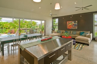
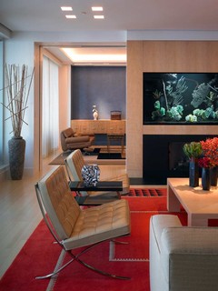
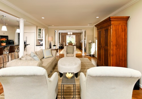
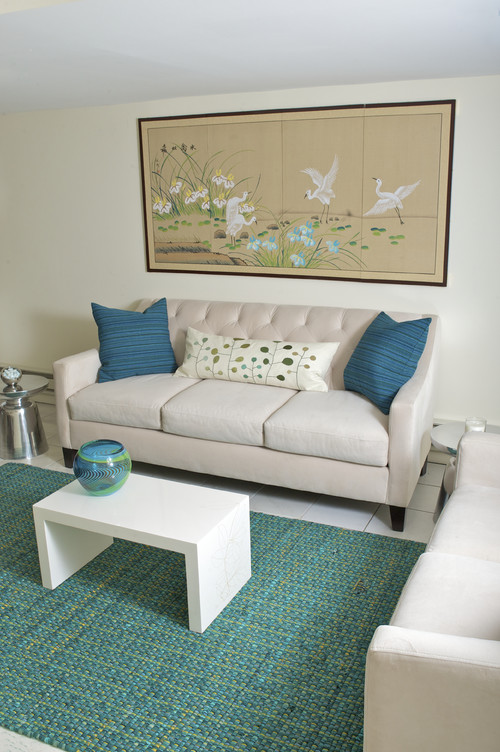
1. To anchor or define a separate area within a larger space especially in open plan homes

The Neoteric Classic modern kitchen
  refined island designs


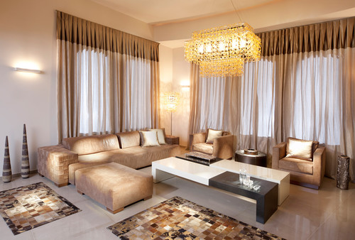
The value of the colour of the accent wall  is kept in check with the overall look of the room.  It isn't jarring but it does help to define the seating area. 

Alterstudio modern dining room
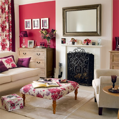
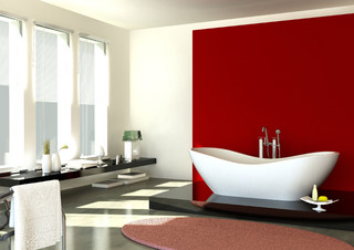
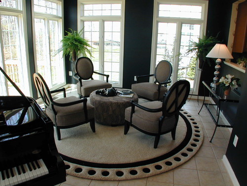
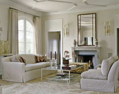
2.To highlight a large focal point on or near a wall


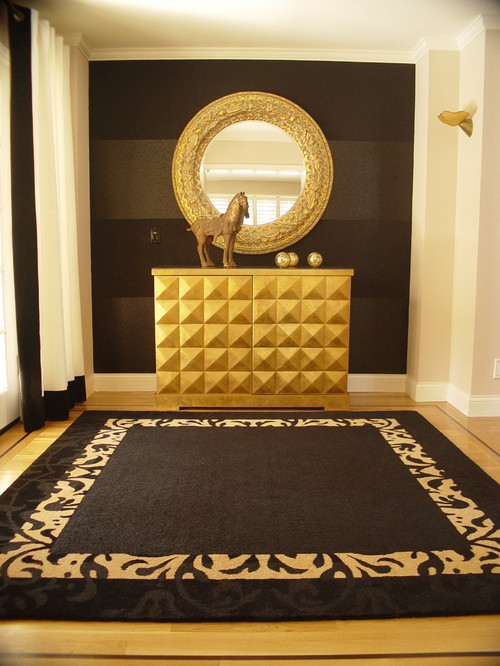
The addition of red/rose to the recessed areas of the wall further highlights the fireplace and creates a commanding focal area in a small room. The focal colour is well distributed around the room providing good colour balance.


Interior re-design and interior re-designers-Blacksheep Design UK are residentia contemporary living room
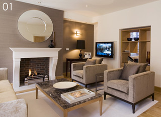
The lighter taupe colour used to accent the firplace is soft and helps to focus the eye on the fireplace wall without overwhelming the overall quiet tone of this room.

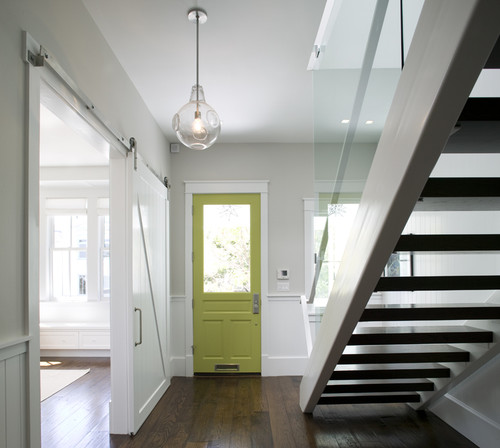
3.To pull a viewer's eye through a room

 source

Your  eye automatically moves through this space to the opposite wall. The same effect could be achieved with a less intense colour though.  Why do so many people automatically use red on accent walls?  In small spaces intense warm colours  make the wall advance and shrink the space visually when you should be thinking about enlarging it.


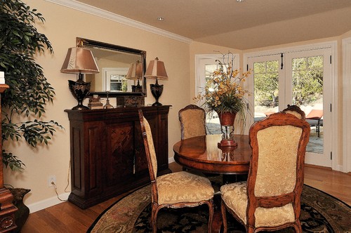
In this room  your eye is caught by the red area rug initially but the use of the gray blue on the wall in the next room makes the space seem like it is going on forever. 


source

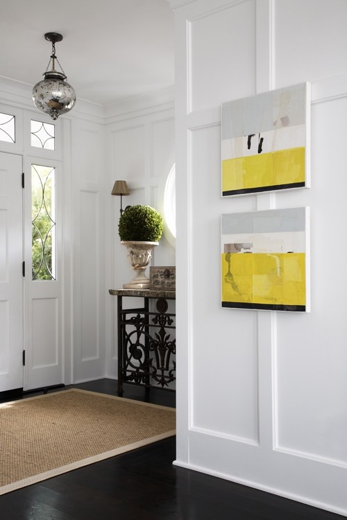
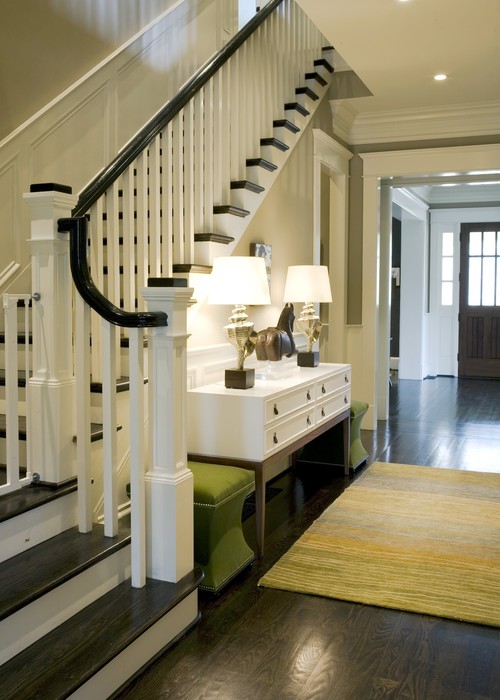
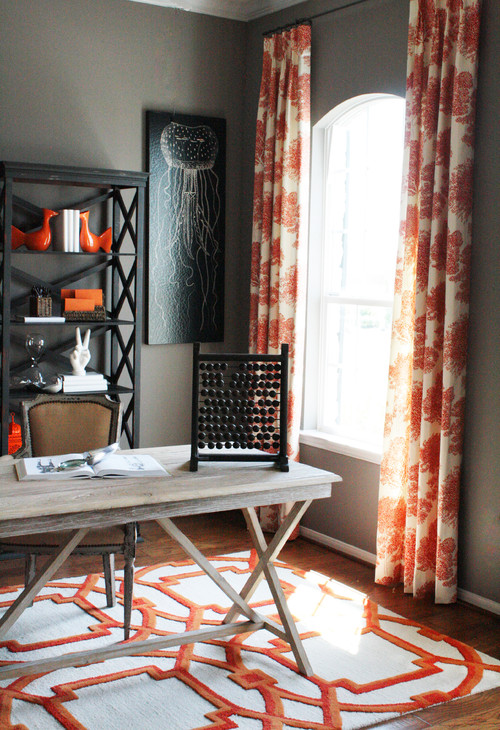
This is a skillful use of an accent wall to pull the viewer through the room .  It also highlight the door and the addition of the vertical metal wall art is perfect for the space. The red also pulls the accent colour through the room. 

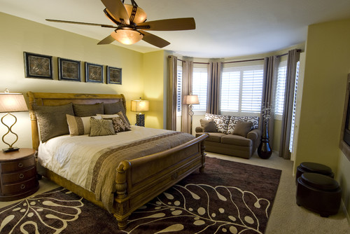
4. To  visually change the proportions of a room - visually enlarge or shrink it

dining room  dining room
Houzz

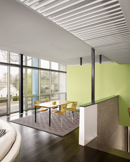
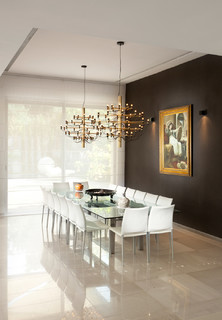
This large space is controlled by the use of the dark accent wall which anchors the space and also provides a backdrop for the dining table. 

highland park contemporary dining room

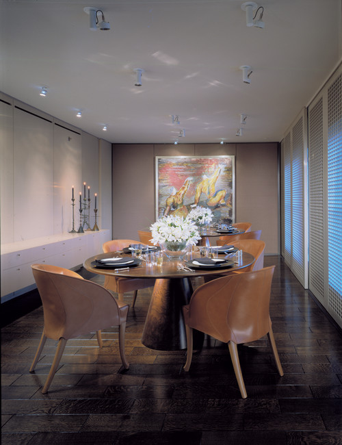
Long narrow rooms can usually take an accent wall which helps to visually shorten the space. The yellow in the artwork adds to this effect.

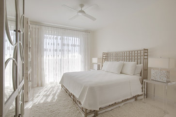
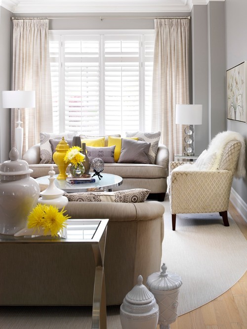
5.To provide a backdrop that frames a room's furniture arrangement (typically the first wall you see when you enter a room).


I love everything about this soft and inviting room.   The accent wall quietly does it job of focusing the eye and highlighting the minimal furniture arrangement. The three piece of art are a great finishing touch.

Aquamar Bathtub modern bathroom
PSCBATH
   
You certainly can't ignore this bathtub.  The splash of red that anchors it makes the room.


Then there are the accent walls that might have been better placed in a room or left out entirely because they cause confusion. As always , this is my humble opinion. 


If I were choosing a wall to accent in this room it would not be the back wall because it is  not the focal point in the room.  Everything points to the fireplace wall including the furniture arrangement. If you felt the far wall needed interest, a large piece of art or an arrangement of art work hung at viewing level would help bring this wall  back into the room.   


Are you a fan of accent walls?

What colour should I paint my entrance?

 When I am choosing colours for a specific space I usually have a set of  very loose guidelines that I consider  when making decisions. These guidelines are not hard and fast rules, rather they have been formed through various experiences and observations over the years.  If I were choosing a colour for an entrance (porch or foyer) here are some of the things I would consider :

The purpose of the space
A doorway serves as a transition from one state of existence to another and this transition can be marked in various ways.  One of the most common strategies is to use colour to reflect your invitation to enter your home. People often  choose a welcoming colour (red, yellow,  green etc. )  or a more stabilizing  colour (brown, black, gray) for their entry door.

  When the door is opened that colour is brought  inside.  If it is a strong colour, I consider it when I am choosing the colour for the interior walls of the porch/foyer. I also like the inside of the door  to serve the same as it does when entering; therefore, I often suggest   painting the inside of the entrance door the same colour as the outside.  This creates a colour unit and adds an accent to the room. This look works exceptionally well when there isn't a lot of other distraction in the decor as the green doors below show. In these rooms the painted doors serve as focal points.

Feldman Architecture, Inc.


House to Home  

I just love that lime green door with the black niche,  but do I ever want to hang a more vibrant, larger scale painting on the dark wall. 

Even though there's patterned wallpaper in the entry below, the strength and size of the door make it a dominant feature  in the room.  The black railing and art work connects the eye to the door to create visual flow.   Entrances are an excellent place to use wallpaper to achieve the colour you want and to inject texture/pattern into the space. I know that many people have a hard time warming up to  wallpaper, but it does have its purposes.


An entrance  is a transition space into the rest of the house  or another way to think about it is that it is the beginning of a colour journey. Not much time is spent there. For that reason I think it provides a safe area to be adventurous with colour.  How adventurous I get depends on the amount of light entering the space.   When choosing colours I will often look at any interesting colours on the outside of the house-  shrubs, flowers, accessories -  that might suggest a colour to bring inside.  I also like to use "nature colours" ( toned greens, blues) in entrances because they carry the outside in.


the lennoxx

Nicole Sassaman 

I like the repetition of greenery from outside to inside and the inclusion of this chest with multiple drawers would be great for storage... but would you ever find what you placed  there?


Splashes of nature or nature inspired motifs also add to the welcoming feeling in an entrance especially when they are backed by a neutral colour.

The goal  when choosing a colour scheme for your home is to create a continuous flow from  room to room, with each space complementing  the other.  I like the journey from entry into the rest of the house to be a progression from a  little darker/brighter colour into lightness. You'll want the room to have impact and make a statement. After all, this is where your guests will get a preview of the rest of your home. At the same time the entrance  serves as the connector to the rest of the house. When this transition is obvious  without a door to close the area off, my solution is usually  to choose a neutral gray/taupe that sets a sophisticated tone but doesn't cause you difficulty when running it into the next colour. See the perfect example below.  Not so sure about that yellow chandelier thought!


Orientation factors 
I am a firm believer in  considering the  type of light you have entering a space and choosing colours to "correct" the light.   I'm most concerned with north light because it is  cooler and will need to be warmed up with the right colour selection- yellows, rusts, oranges, reds or warm neutrals etc. 


Did you notice that the warmest colour was on the ceiling?  It makes the whole room glow.  


I can't imagine a warmer room.  I'm not a fond lover of orange /rust on walls but it really works in this space. 


What should you do if you have your heart set on a cool colour in  your north facing entrance?   I would say go ahead- I did! I just made sure I had a warm colour on the doors and suitable accessories to warm up the space.  There's always a way in decorating.

Art as Pop traditional entry
This overall cool entry is warmed up by the use of two beautiful art works. The yellow is like a beacon of warmth considering it is a cooler yellow.Did you notice the topiary tree used to bring the outside in and how it plays visually with the foliage outside the window?

If your  space faces south it will get warmer light and cooler colours will help to tone down the warmth. Personally I don't think a space can appear too warm especially in northern climates.  In east or west orientations you have a wide range of colour choices.

How does your entrance look these days? 


Colouring outside the box with orange

Left to my own devices I would choose orange as either an accent or a main colour in decorating a home.  I am happy to see bits of orange in artwork, but that's as exciting as I can get about it.  To give orange a chance I decided to explore how others have used it to create stimulating decors.  Of course, no matter what you do with orange it will be vibrant and commanding. It is not a sit back colour!  I find  that people who love orange have personalities very like the colour. 


An orange sofa  begs to be noticed.  For most people furniture is a big ticket item, and cautiousness is often the ruling factor when purchasing  because you don't want to tire of it quickly.   I love the freshness of this room because it reminds me of eating melon on a tropical island. 


Is the wallpaper the accent wall or is it the orange wall? Circles and orange is about as energetic as you can get.  I love circular motifs.  How many circles are too many for you?


I like the way orange looks with gray.  But then again, I love gray with anything. You better love orange if you decide to put it on your cabinets.

Tineke triggs contemporary bedroom
tineke triggs


Freshness prevails when orange is used with beige and a bit of blue gray thrown in.


Astoria Guest Retreat eclectic bedroom
Domicile Interior Design

Just a little does the trick to liven up this very neutral space. 


source  

This is a funky colour on a very traditional piece of furniture but it works for me.   Accent pieces should have some energy to them.  

source

Purple and orange make a striking combination which works very well especially for a child's room.

source 

Take your cue from artwork when you want to add an accent colour in your decor.   

or ....

if you love orange just a little bit, let it  perform its magic in an artwork as it does in my dining  room .

Artwork by Carolyne Honey Harrison


Visit House Beautiful for a slide show of decorator's top picks for orange paint.

How to choose the right area rug

People have been using rugs since the earliest days of history. Initially they were made of animal skins and served very functional purposes. Today this functional role has been replaced  by a purely aesthetic one.  Rugs  have several purposes in home decor:  they add texture and colour to a room;  they establish zones in large rooms;  they anchor furniture and complement a colour scheme or other elements.    

The size of an area rug dictates how you will use it in your home. Smaller to mid size rugs ( 2’X3’, 3’X5’ and 4’X6’) are used to highlight or accent other features in a room.  They are used effectively in a bathroom, kitchen, entrance or hallway or

living room contemporary living room

....... in a living room it seems. 


Modern Classic contemporary entry
Jona Collins


There's no doubt that this small but dramatic area rug completes this space.  


Stair  staircase
Brian Watford ID

This is another example of a well placed small rug that enhances the other items in the space.

Larger size rugs (6’X9’, 8’X10’, 9’X12’ and 12’X15’)  are used in living rooms and dining rooms. It is also possible to order irregular shaped rugs or have carpet bound to fit any size you request.

Full coverage 

If you are dealing with flooring that is not up to scratch or you dislike the tone of your flooring you can opt to cover  the problem with an area rug. In that situation you should aim to have your rug anywhere from 1 to 3 feet  from the walls to allow you to see the flooring underneath.  If you have a fireplace or closet protruding into the  room you should use this as your "wall" and measure from it.

Dining Room Rugs

The most important aspect to consider when you are buying a dining room area rug is the size of your table and how far a chair extends when you pull it out.  There's nothing more annoying than always catching the leg of a chair on the edge of a rug or having an uneven seat because two legs are on the rug and two are off.  A general rule of thumb for determining a minimum rug  size for your dining room is to extend your rug at least two feet beyond the edges of your table.If your table is three feet wide the width of your rug would be need to be at least 7  feet wide.  The next standard size would be 8 x 10'.


source

This is obviously a custom rug because it fits the dimensions of the table perfectly.   

Debra Campbell Design traditional dining room
Debra Campbell Design


The shape of your rug should also mimic your table shape- round with round, oval with oval etc.

Living Room Rugs

In living rooms rugs usually establish conversation areas.  Depending on the size of your space you may have one or more areas to define.   If you have an open concept home,  rugs can  break up the larger space into both a living and a dining area.

Case Design/Remodeling, Inc. traditional living room

Forest Manor Model Home modern living room
I'm imagining that this is one end of a larger space. I love the repetition of circular shapes and the black and white scheme.  The circular shape  of the rug mimics the chair layout and the ottoman. Who wouldn't want to have a glass of wine here?

Let's look at some of the size and placement guidelines in living rooms.

If you want your sofa and chairs to rest on the rug it should extend at least a foot beyond the back of the sofa. 

Austin Patterson Disston Architects traditional living room


 You can also purchase a smaller rug that allows just  front legs of the sofa to rest on it.  This is one of the options for a 6 x 9 rug.


Smaller rugs like 4 x 6' work well under a coffee table. These would float under the table and function as a separator between the table and the floor.  If your table and flooring are close in value (both are dark or light) an area rug is highly desirable to show your table to best advantage.

 source


This is such a happy room!  Only the tables are dark,  the area rug follows this trend and adds only design and texture.


source

This small area rug provides an additional  way to add an accent colour in the room.

Bedroom Rugs

 If you are using a large rug in a bedroom it does not need to be centered. Consider having the same amount of floor space on two or three sides of the rug. Often rugs are used to highlight the placement of the bed. In this application a highly patterned rug would be  wasted because much of it would be under the bed.

Traditional furnishings translated to a transitional look eclectic bedroom
While there is a pattern on this rug the scale is large and it shows well.


A totally monochromatic room depends on texture to be successful. The area rug just had to be shag.

Did you notice another trend running through most of these photos?


Make your accessories count

If you're hesitant about the latest colour trends when it comes to large pieces of furniture or walls, go wild by purchasing several new accessories.  It goes without saying that you have to find a new home for the ones you are replacing.

My trusted friends when I want to turn things up a notch are pillows and painted furniture because you can  change your look and keep the same objects (of course it helps if you know how to sew). Moving artwork from room to room is a close second in low cost updates in your home.


Consider using brightly coloured accents with neutral walls. Some of my favourite Benjamin Moore go - to colours for walls are: 

 Elephant Tusk  OC 8

Natural Linen CC 90

 Stone Hearth CC 490

Revere Pewter HC 172

Now that we have ideas for a neutral backdrop, the sky's the limit for accents. Choose from reds, fuchsias, purples, sapphire blue, yellow greens ,  turquoise, corals or soft oranges. Oranges are particularly prevalent in design forecasts for 2011.  Choose vases, pillows, baskets, candles, throws, bowls,  lamps, mats/rugs, draperies or anything else that you can think of .


Dining Room traditional dining room
Garrison Hullinger Interior Design Inc.

Red works beautifully in this vignette .  I particularly like the geometric step pattern in the front pillow that is backed by a solid colour. This arrangement makes the pattern even more obvious.  Your eye naturally moves to the large red vase and then tracks to the subtle hints of red in the art work. Always think in threes of varying proportions  when you are setting up a vignette of this type. The same is true  when you create a  composition in visual art.  I jokingly call this approach The Three Bears -Papa Bear, Mama Bear and Baby Bear to indicate the need for varying proportions of the same colour. 

Hurtado´s girls contemporary kids
Silvia Garcia Interiores

Solids, stripes and florals backed by a padded headboard in red  What a lovely burst of colour energy for a room.  I'm assuming the art work over the bed is fabric stretched over a frame.  It's time to get out the sewing machine and staple gun. 

Teal Blue Home Office Design contemporary home office
Marie Burgos Design

The beautiful blue in the rug, pillows and bowl are allocated in varying amounts of blue which add interest and move your eye around. 

 Traditional Home

Blue and orange are a hot, hot  combination this year. It keeps coming up in every magazine I look at.  Layering is the name of the game in this room.  You could achieve the look of layered colour and pattern on the mirror by adding a backing of MDF to the mirror which you would paint.  Another suggestion is to paint  an orange rectangle on the wall and then mounting the mirror on top of it.

I love using two colours of side panels because it allows you  to easily change the accent colour down the road.  There are many good quality ready made panels that are not too expensive.  For those of you who don't  require  full length draperies (96 inches), you will have fabric left over when you hem to the required length.  This material in turn can be used  to make accent pillows.

Traditional Home

 Massed together over a table these colourful graphic designs  provide quite a focal point.

Traditional Home 

 Finding lamps that have vibrant colours is usually a chore where I live.  Sometimes buying a colourful lamp can be limiting but  you can  make it work for you.  My favourite trick is to move a lamp from one room to another as your colour scheme changes. Photos of my rooms over the last ten years suggest a  bad case of" have lamp will travel". I'm showing my age with that reference!

Study contemporary home office
 The rug makes this room, but I'm sure it isn't an inexpensive item! When accessorizing your can go overboard with too many small hits of the same colour that reminds me of a scattering of snow. Remember to variety in proportions. 

Decor by Jennifer Inc contemporary family room
Jennifer Brouwer

I can't get enough of this room.  Yellow, vibrant and beautiful, is a wonderful accent in this predominantly white and gray room. I like the way it is used sparingly but it does the trick.  

findings

Do you have favourite ways to accessorize? 
Powered by Blogger.