I'm always on the look out for what's new in colour schemes (knowing full well that there's nothing new , only recycled, slightly adjusted past trends). I recently read an interesting post on Color Sizzle titled Tiger's Eye; the name immediately brought a range of colours to mind. Intrigued, I read on. Just as I expected, Kelly was referring to those golden amber to honey brown colours suggesting that "if you've been looking for a neutral other than gray or beige, tiger-eye is a great alternative that creates a warm backdrop for many different colors and wood finishes" Think luscious, elegant and cozy.

Then I found a second post by Erica Ward on Houzz who heralded that "old gold" is a new neutral, but gold with a twist - not it's heavy or brassy predecessor we lived through in past years.
Now I'm having difficulty warming up to these pronouncements because I'm basically a gray lover, but I do love gray and yellow together so I suppose that's a start. I am willing to give any colour a chance to convince me of its merits.
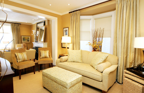
This is a similar look as the monochromatic living room above that is enhanced by the gold on the tray ceiling which causes the rest of the room to glow.


Then I found a second post by Erica Ward on Houzz who heralded that "old gold" is a new neutral, but gold with a twist - not it's heavy or brassy predecessor we lived through in past years.
Now I'm having difficulty warming up to these pronouncements because I'm basically a gray lover, but I do love gray and yellow together so I suppose that's a start. I am willing to give any colour a chance to convince me of its merits.
The "new" gold is not gaudy or flamboyant, dark or drab or used in excess. Call it what you will, gold has always been a staple for homeowners who want warmth, but there's an updated take on this hue. For 2011 we're talking about gentler, softer gold tones, often with a matte look.
Valerie DeRoy Interiors, LLC
This palest of golds, soft and toned, adds warmth without boldness. The overall look is light and pleasing and one you would not tire of quickly.
Nora Schneider Interior Design
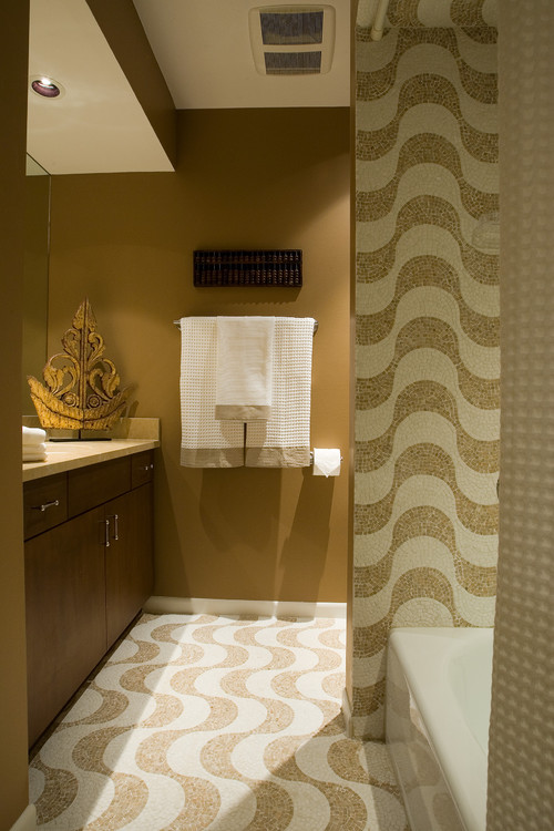
This bathroom has the same overall feel as the room above even though the wall colour is a little darker.
toronto interior designer Jennifer Brouwer
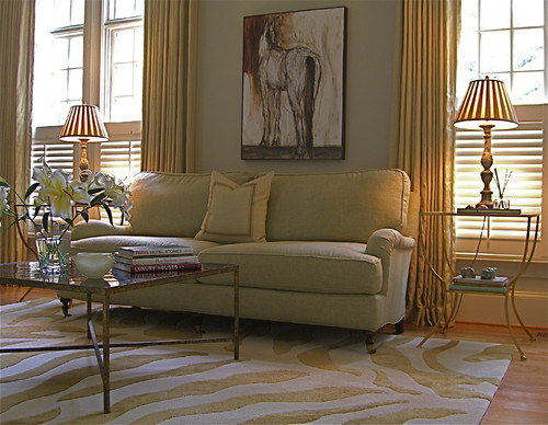
Monochromatic, rich and restful in various values of gold from the softest cream to a buttery gold on the walls.
miami showroom Capitol Lighting
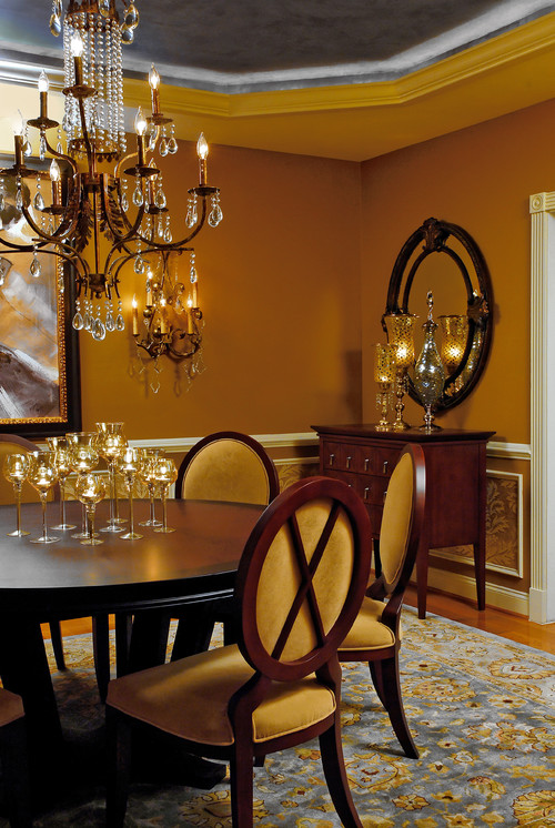
This is a similar look as the monochromatic living room above that is enhanced by the gold on the tray ceiling which causes the rest of the room to glow.

via The Lennoxx
This sumptuous bedroom designed by Jan Showers invites relaxation. It seems I'm particularly attracted to a monochromatic look.
Paula Grace Designs, Inc.
 The Lennoxx
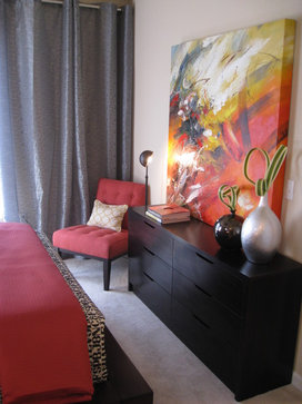
This amber colour is very complementary to darker wood tones and the added hints of gray blue makes the colour sing rich and luxurious.

spaces design
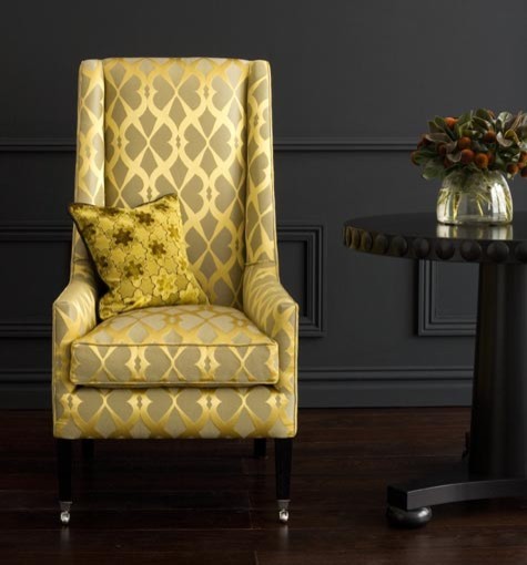
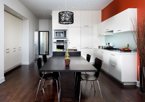
Then there's gold used as an accent. I always like the way gold work with black, blue or charcoal.
Then there's gold used as an accent. I always like the way gold work with black, blue or charcoal.
Labels:
colour schemes


.jpg)
.jpg)


