Are you challenged when it comes to arranging accessories? Do you look at details in decorating magazines and marvel at how everything looks just right? Many people think the final touches are the most difficult part of home decor, but they don't have to be. There are all kinds of tips and tricks of the trade.
One of the simplest design tips I can offer is the use of letter formations to organize interesting accessory vignettes. I'm calling on my background in visual art and floral arrangement to offer you this advice. Other decorators may have different ways of describing their approach.
The most useful letters for designing vignettes are .... A, V, O, C, L, and M.
Here goes...
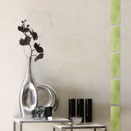
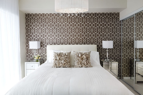
A
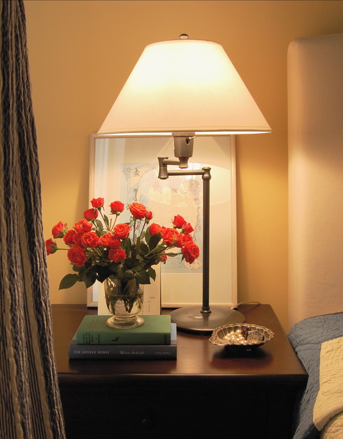
This is a very tight A line of design. The visual height is always through the middle and the base is wider, but the bottom width can vary. My eye wants to see something slightly taller than the dish - a sphere would be lovely here. Perhaps the owner is like me, always looking for just the right object to finish a room.

Another A with a very broad base. I want the two back photos to be a little taller. Are you noticing how the height is usually a piece of art? It could also be a sculpture, a mirror, a tall vase of twigs or flowers or photos hung on the wall.
V

Pinterest
The reverse of A is V. Sometimes only these two shapes are presented in vignette discussions, but there are so many more ways to think about it. In a V the lowest point is usually in the middle of the arrangement. Sometimes thinking about it as a check mark is helpful because one side is usually taller and one is shorter.
C
Lucid Interior Design Inc.
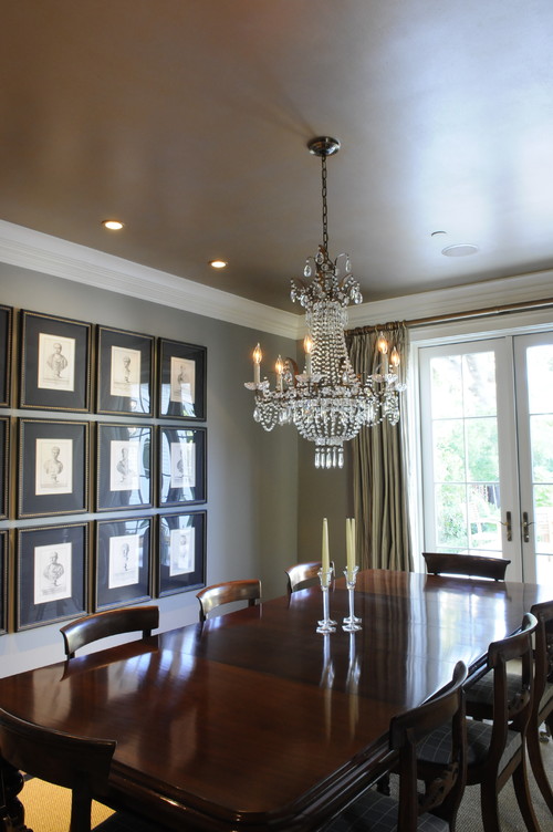
You don't often find C lines of design and they are the most obvious when there's only one object banked by something that is circular. Your eye just wants to make that sweep. All the other circle shapes in the furniture help to reinforce the C movement.

Pinterest
A great example of a C (backwards) with more than one item stacked to the right of the mirror. If the twigs were more of a falling shape the C our be even more obvious.
o
You don't often find C lines of design and they are the most obvious when there's only one object banked by something that is circular. Your eye just wants to make that sweep. All the other circle shapes in the furniture help to reinforce the C movement.
A great example of a C (backwards) with more than one item stacked to the right of the mirror. If the twigs were more of a falling shape the C our be even more obvious.
o
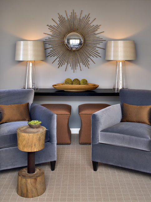
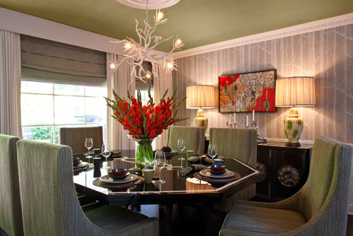
Joni Spear Interior Design
Some designers may argue this is a classic V formation but I would disagree because the the mirror causes the eye to move in a circular fashion around the display. The lamps are taken in with that sweep.
Rachel Reider Interiors
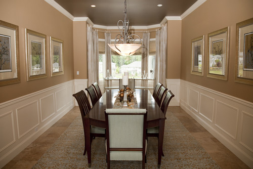
Another symmetrical O line of design . The base is set so broadly that your eye just wants to do the circular movement around the objects. The three rounded shapes add to the circular movement. If the base was tighter it would look like a classic V shape.

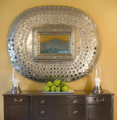
Pinterest
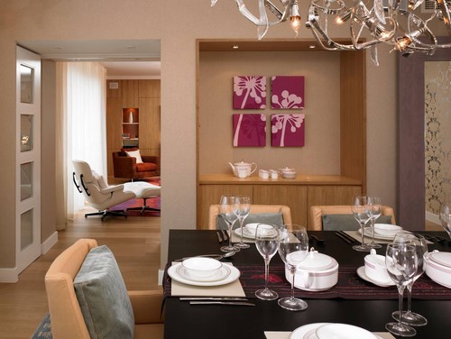
This traditional vignette follows an O shape because of the arrangement of art above the table. It takes command of the eye and the objects on the table are swept up in that motion.
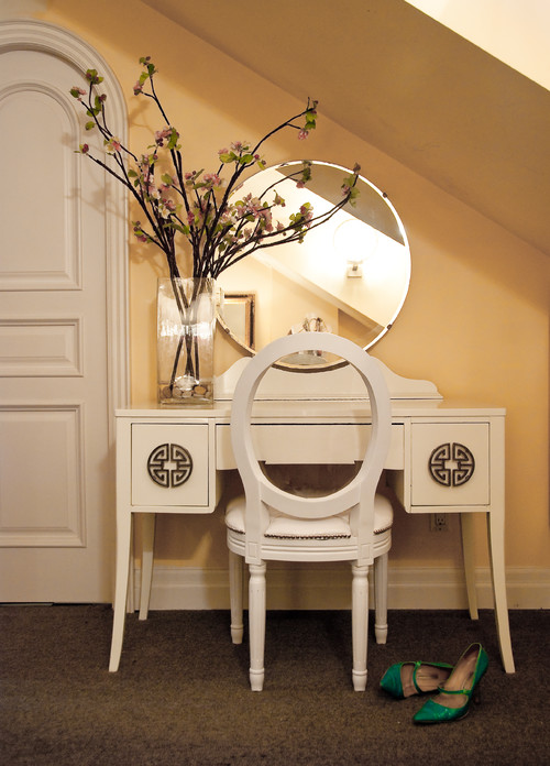
L
CNW PRODUCTION
Some designers may argue this is a classic V formation but I would disagree because the the mirror causes the eye to move in a circular fashion around the display. The lamps are taken in with that sweep.
Rachel Reider Interiors
Another symmetrical O line of design . The base is set so broadly that your eye just wants to do the circular movement around the objects. The three rounded shapes add to the circular movement. If the base was tighter it would look like a classic V shape.
This traditional vignette follows an O shape because of the arrangement of art above the table. It takes command of the eye and the objects on the table are swept up in that motion.
L
CNW PRODUCTION
Urrutia Design
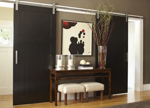
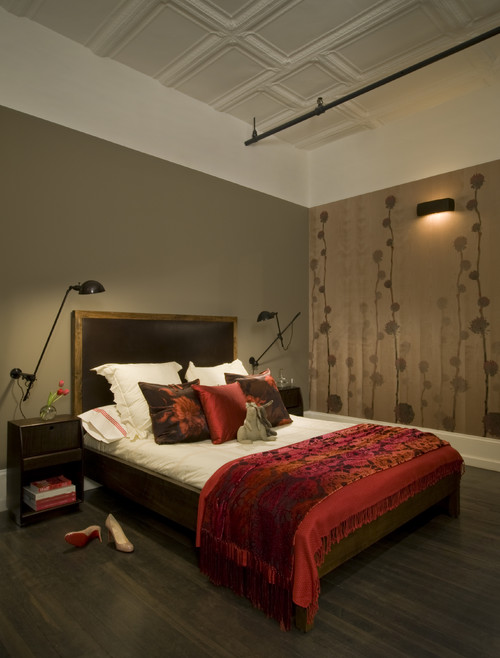
The requirement for an L line of design is a very tall object placed on the edge of the design with a broad base. Of course you can also reverse the L. If the hurricanes were taller I would call the vignette above a V.
The requirement for an L line of design is a very tall object placed on the edge of the design with a broad base. Of course you can also reverse the L. If the hurricanes were taller I would call the vignette above a V.
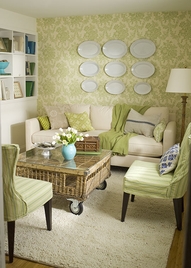
M


You don't often see the M line of design used, but it works well when you are displaying collections where you have several heights with a dip in the middle.If the shorter objects are on either end it is an M but when you start with taller objects on the ends it moves into a W.
What line of design do these vignettes follow?


What line of design do these vignettes follow?


And there you have it. The answers in order A , M, V. Keep your eyes open when you see arrangements and observe the lines of design used. Then start arranging!
Labels:
accessories,
lines of design.,
tablescapes,
vignettes


.jpg)
.jpg)


