This is the first post of a series I have planned to focus on arranging objects in a pleasing way in your home.
Do you have....
Kissing objects
That's the best way to describe objects that touch each other or look like they are touching thus causing an odd tension/confusion. Is it one object? Two objects? Why are they side by side? etc.


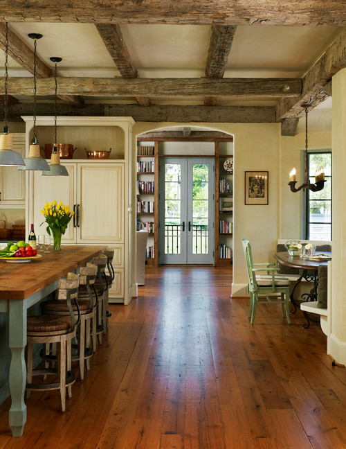
When the objects are overlapped slightly you create more visual interest and depth. If you can add a third object for variety, so much the better. Note the spacing in the middle.


Exception to the rule
Then there is the exception to the rule. I don't think having the two pots touching in this vignette is at all boring because of the variety in direction and shape created by the small trees. The enclosed space between the pots is interesting because of the legs. There is so much else going on that this just works well.

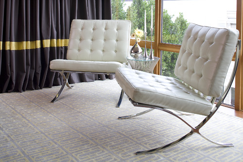
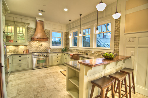
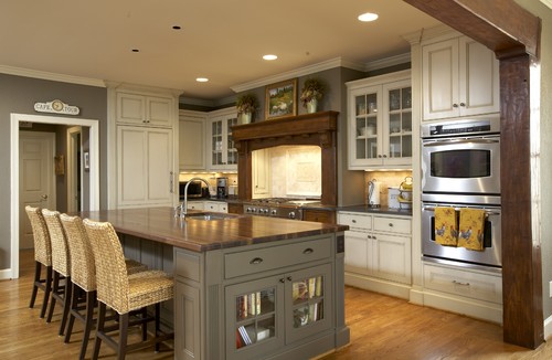
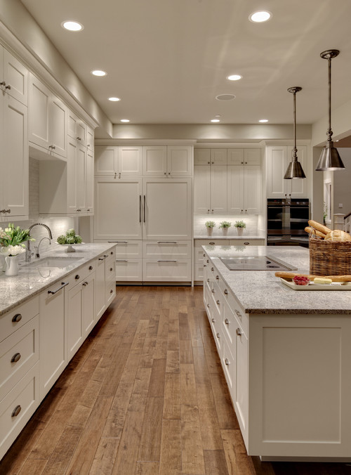
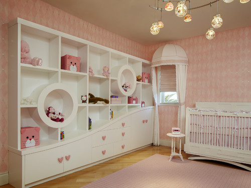
Furniture can kiss too! When you have a curved/slanted arm on a sofa or chair move your end table out so it is not touching the sofa. It frees up space and creates visual ease. If the arm of sofa is curved you often have to move a table out even further.
The same principles of design that are the backbone of a good painting can be applied to designing a room or a vignette. People often know when something doesn't look right , but they might not be able to articulate why they have that feeling. I thought I would focus on some of the finer points that can move a space from fine to fantastic.
Do you have....
Kissing objects
That's the best way to describe objects that touch each other or look like they are touching thus causing an odd tension/confusion. Is it one object? Two objects? Why are they side by side? etc.

These two nesting dolls tell the story. Do you want to move them apart? Another thing that happens when object touch or are too close together is the creation of boring negative space especially when the objects have the same form. You can see that the shape between the two dolls in almost symmetrical.

When the objects are overlapped slightly you create more visual interest and depth. If you can add a third object for variety, so much the better. Note the spacing in the middle.

I would be the first person to admit that there are beautiful objects in this collection, but I want to appreciate them individually.
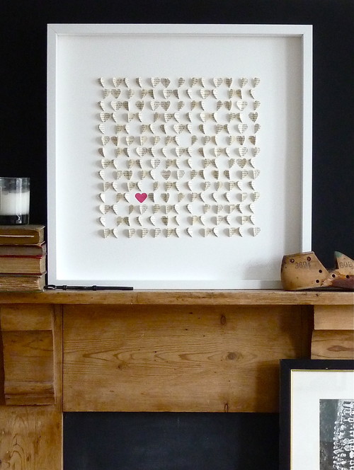
If you have a huge quantity of objects in a collection you might be better served by choosing a more thougtht out way of displaying them rather than massing them together randomly. This collection reads as quantity and the beautiful forms are lost in the "gathering".

Exception to the rule
Then there is the exception to the rule. I don't think having the two pots touching in this vignette is at all boring because of the variety in direction and shape created by the small trees. The enclosed space between the pots is interesting because of the legs. There is so much else going on that this just works well.

Furniture can kiss too! When you have a curved/slanted arm on a sofa or chair move your end table out so it is not touching the sofa. It frees up space and creates visual ease. If the arm of sofa is curved you often have to move a table out even further.
Labels:
design issues,
design tips,
vignettes


.jpg)


