Design trends for the new year

This time of year many design blogs and magazines present trend forecasts for the coming year.  They are interesting to read, but one has to recognize they are best guesses based on the knowledge and intuition  of the individual writer or design group.


On every newstand this month you'll see design magazines with design trends a prominent feature on their front covers. On closer inspection you may find there isn't a great deal of overlap from article to article and you have to work to piece together exactly what the trends are.  Exploration online offers almost too much information on the subject and the sheer quantity boggles your mind, but I keep reading.   Over the next several posts I'll  explore the  trends that appeal to my design aesthetic. 

Re-purposing 
This is a continuing trend from 2010 and I predict with the focus on everything green it will continue well into the future.  Finding creative ways to use what you have or to recycle furniture and objects from other sources  provides satisfaction on many levels. Re-purposing will be combined with buying new to develop a more unique, individual look that has a history. 

photo: Margaret Ryall
 artwork:  Will Gill  
This wicker chair acquired from a second hand store is one of my favourite pieces of furniture. I was attracted to it because of its unusual shape and I could see  beyond the horrible orange wicker and brown seat pad.  After four cans of spray paint it took on a new life.

I like a comfortable, more casual feel in my home,  therefore re-purposing has always been part of my design approach. I'm on the look out for a new chest of drawers to replace my sad little wicker set which is lost next to the chair. Then a  long overdue reorganization of this  space will be necessary.  The hunt is part of the fun.Yes, decorators have design problems like their clients and solutions need patience.


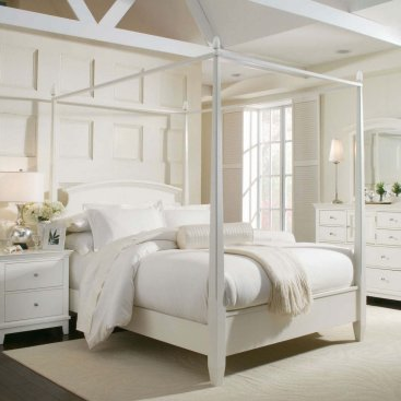
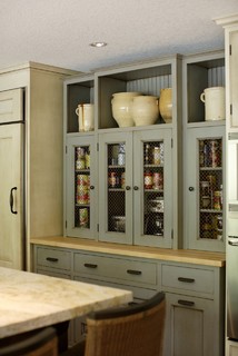
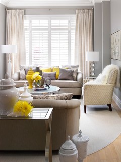
Sculptural White Objects:
The simplicity of grouped white pottery and sculpture has always appealed to me and I've used this interest in different ways over the years.  Finally it's a trend according to Canadian House and Home!


photos: Margaret Ryall


White vases to covet.....


Check out the attic and the back cupboard, talk to your family and friends. Perhaps you can re-purpose white objects into a beautiful grouping.

Should I follow colour trends?

Do you plan to change your colour scheme in the new year?


Have you been  looking for a colour scheme you won't see in every other house you visit?

Washington Park Residence 06 traditional kitchen

Here's a post just for  you.

Striving for individuality in your home is an up hill battle as I know from choosing colour scemes for my own home. Six years ago I repainted the first floor of my house at a time when heavy earth colours were popular .


 The thought of using  dark  colours on my walls depressed me because they absorb too much outside light, and I need light to be happy.  So I choose a  colour scheme that was light and  neutral based on creams and grays.  I threw current trends to the four winds and created rooms I was happy in.  Six years have passed and now  my house is trendy!
 
While I'm very aware of design trends, there's an aspect of my personality that likes to fight them a little. Rather than giving advice to follow the latest colour trends, I feel the most important aspect of my role as an interior decorator is  to help clients develop a colour scheme that makes them happy  and comfortable.  That means keeping an open mind about all colour.

I'm a firm believer that you can use any colour you want in a room if it works with your furniture and the light. It's a matter of finding the value of the colour that works  and then expanding the scheme  with accents.  

You can develop your own style by starting with a colour you love and building on it. If you love yellow and think it is too much on walls, use it as an accent.


 If you love pink, use it!

If pristine is more to your taste , go there.  

Remember...

"Be faithful to your own taste because nothing you really like is ever out of style." ~Billy Baldwin

The magic colour

Is there a magic colour that solves a lot of problems when developing a colour scheme? 
Read on.

white furniture with vivid colours
 White furniture provides  relief from vibrant colours

This is a vivid colour scheme that could become a problem without the balance provided by the sofa and chair.  Soft white shows the other colours to great advantage creating a clean, crisp scheme.


White furniture in a dark colour scheme
 source

Brown on walls can create quite a dreary colour scheme, but  this room it is anything but dreary. The touches of yellow brighten it and white is quietly doing its job.


Beach House Bridgehampton modern bedroom
Crisp white and green

Amy Lau Design


Can you have too much of one colour in a room?  Yes,  this could have been such a room without the judicious use of white and creamy yellow accents.


soft white furniture in modern decor
Soft white in modern decor
source

What other colour could produce this much impact with a purple wall?

More This eclectic bedroom
This-eclectic-bedroom


Blues softened and connected by white, the magic colour. 
But.....


Is white a colour?
Scientifically speaking, it’s actually the combination of all colors in the visible spectrum of light.

Season's Greetings

Breathe (2004) 10 x 30 acrylic, paper on canvas
Margaret Ryall

Merry Christmas 
and 
Happy New Year
from 
my house to yours

Yellow colour schemes

Bright or soft?
 Pure, bright yellow is a very visually demanding colour which is difficlult to ignore- in other words, a little goes a long way. Softer yellows work better on walls so save the bright yellows for accents.

Light or dark?
Yellow is a tricky colour because it always looks darker on walls that you expect when you choose it from a colour card. If you have a certain tint or shade of yellow in mind it is a good idea to choose something a little lighter than you think you want. 

Walls or accent?
When you choose to put yellow on a wall, it needs some space to shine,  therefore, grays and whites provide a perfect foil for it.

Yellow looks great with citrus colours as accents so look for lime greens or oranges if you want a fresh, clean look. that will energize you every time you walk into a room. Yellows work well in north light.
source

This is another room where yellow is used successfully on walls without overwhelming the rest of the decor. Again white provides a perfect accent to keep the yellow in check.

Sometimes people love yellow but are afraid to commit to yellow  walls because it can overwhelm a room.   For the faint of heart yellow accents can do the trick to warm up an otherwise cool decor.  


source

The small splashes of yellow in these two rooms are all the convincing I need to say yes to yellow as an accent colour. Yellow accents with gray are my all time favourite.
Bright yellow, white and black is a fresh colour scheme for a teen's room.  In this application no yellow is too bright!

As you can tell from the previous pics I'm obviously attracted to yellows used with white.  Let's move on to other combinations.

Master Bedroom2 traditional bedroom
I always appreciate how touches of yellow will warm up a room that would otherwise be cool.   I find an all cool or all warm palette boring ,and I always like to break it up with the addition of the opposite temperature if only in accents. 


An orangy yellow and brown have been used to create a soft look in this bedroom. The hint of pink in the pillows and the soft buttery colour of the throw further softens the overall feel of the room. Don't be afraid to mix several yellows in one room.

Pantry & Baking Center traditional kitchen
Jenni Leasia Design


This soft cream and historical green create a perfect combination for a traditional kitchen.  There's nothing here to dazzle the eye; it's all about subtlety.

dominomag modern kids

This is a brave combination for a baby's room.  Black is difficult to work with. but it's harshness is balanced by the striped  yellow ceiling.  I'm glad I'm not the one who had to paint it. I'd be tempted to paint the bureau yellow too to spread the colour around the room. 

Sacha & Johans High Risk / High Reward Home House Call | Apartment Therapy New eclectic bedroom

If I could choose to live in any of the rooms shown in this post this would be the one I would like to see when I opened my door after a busy day.   It's the essence of sophistication and relaxation. 

Which room would you like to see when you opened your door at the end of a long day? 


Purple Love

Purple is a colour that inspires passionate reactions. You either love it  or hate it.  In my case,  I love it.  I'm always surprised by the strong reaction  I receive when I mention any tint or shade of purple as a design solution to clients.

Purple combines the tranquility of blue with the excitement of red. It is said that purple is associated with non-conformists such as artists or designers.  It draws out intuition and encourages creativity. Shades of purple are restful and comforting and can often be found in religious symbols.  Purple has long been a symbol of royalty and mystery.

 So where can you go with purple in decorating?

Purple can be used as a complete envelope for a room. 


You have to really love purple to take this approach to its use. Even when grays and white are added in,  there's still a lot of purple. 

 This room depends almost totally on purple.  Much too saturated for my tastes, and I think one would tire of it quickly. There are lovely accents here that could be added into other schemes.

While there's still a large percentage of purple in this room, the softness of the colour provides a calming backdrop for living. Purple and brown work well together and it is a combination rarely seen.


Playing it safe with accents.....


The drapes in this room provide a great backdrop for the  green bedspread. I find spring greens and purples particularly pleasing to the eye.  

Soft and playful..... 


Going a little wild......
 
One of the strengths of a neutral palette is the option to use a really strong splash of colour with it.  This ceiling is daring and inspired and makes this toned down decor rich and exciting while working well with the purplish gray cabinets and table.  The additional hints of purple around the room help to anchor the colour.

source

A splash of purple in an area rug and a gentle hint in a pillow ties this room together. In this room the art is on the floor!

 For those that truly love purple, check out The Purple Store.


Design Tip: photograph trouble spots

  • Do you want to discover trouble spots in your interior design? 
  • Do you have a room where something seems off but you don't know what the problem is? 
  • Are you wondering if your room is completed?
Take a photograph of the  room in question and have a critical look at what is happening.  There is something about the two dimensionality of photography that makes problem areas pop out especially scale /proportion. (Proportion involves the relationship of size between objects. Proportion  also includes the relative sizes of surface areas of different colors). Here's a telling photo of  my own living room.


This tiny chest of drawers looks minute and lost  next to the chair.  The area need something more substantial to balance the weight of the chair next to it. I'm still looking for the perfect piece and that is how it goes.

Creating natural arrangements for Christmas

Arranging natural materials creatively requires knowledge of balance and proportion.  Some people seem to have natural instincts in this area, but  the skills can be learned from floral arranging books. 


Christmas planter birch magnolia twigs

By using the following four elements you can achieve a stunning Christmas planter.

1. Droopers (Spillers)

While there are many places/ways to start, I usually start with the hanging material  to cover the edges of the pot. These have to be set in almost horizontally  as the cedar in the above image.  You want it to droop gracefully and cover the edges of the pot. 
 
- Spanish broom
-  pine
-spruce branches
- cedar


2.Uprights (Thrillers)
Sometimes if I have interesting tall materials  I arrange them first to establish height and then work out and down.  Thrillers are always tall and act as the apex of the triangle design.
- dried goats beard stalks
- corkscrew hazel
- yellow - twig dogwood, red dogwood
- spirea with dried seed heads
- forsythia stalks (which are very light and work well with dogwood branches)
-birch sticks


berries spruce pinecones Christmas planter  Designing Home

 
Twigs make great uprights, and don't forget that small potted trees can be placed in the middle of a planter and other materials can be added to cover the pot. A planter within a planter!


3. Fillers 
Once these two aspects have been arranged you need to fill our the arrangement (fillers) by applying the branches at roughly 45 degrees. I have lots of possibilities in my garden:

- boxwood
-yellow mound cedar
- holly 
- blue spruce
- rhododendron leaves 
- dried hydrangea blooms


4. Accents  

These are the final touches that hightlight and brighten your arrangements.   The sky is the limit here. 

- sprayed grapevine spheres
- brightly coloured plastic ornaments 
- wooden Santas
- plastic ribbons 
- plastic Christmas flowers
- artificial birds 
-woven twig stars

-toys 
- small colourful lanterns
- large sphere shaped ornaments 
- ribbons


berries, pinecones, pods


fresh fruit or plastic fruit
 
 
source

and even birdhouses!

Powered by Blogger.