Summer house DIY

As I sit here in the middle of a raging snowstorm, I'm thinking about my summer house which I want to open next month. Maybe optimism will pay off!  This is the time of year I run through my "to do" list of what I want to accomplish in the coming season.  Most summer home/cottage owners want an inviting, homey atmosphere that can be accomplished on a budget.  I'm no different. Our place is small and quite ordinary looking from the outside, but  we have a million dollar view.

 We are perched on the edge of the Atlantic Ocean on the Bonavista Peninsula in Newfoundland and through the seasons we see icebergs, seabirds, whales and beautiful full moons.  One October I even saw my first display of the Northern Lights.

Come for a virtual visit.

View outside my studio window mid summer
 
Visitors in May

After the storm

Full moon over Bonavista

Before we ever put the plans for the house on paper, the colour scheme  was etched in my mind from my time spend in the community when I was younger.  The inside is a continuation of the outside - ocean, pink/purple slate/ fall meadow and fog. 


It's a back door kind of place (note the dishes in the rack) so we enter into the kitchen area.  Only slate could be used on the kitchen floor because it is a prominent feature of the whole area and works so well with the other colours.  I choose  purple  for an accent wall behind the cabinets which I doctored  with help at  my local paint shop. 

The cabinets were created on a shoestring budget.  My husband made the boxes out of white melamine that was already faced for use in shelving. We bought the doors at a salvage store unfinished. The layout of the kitchen was determined by the door sizes available.   I made a wash from liberal amounts of white and dabs of  the other colours in the house.  The floors are local spruce with the same wash, protected by five coats of water base varathane.  My knowledge of colour mixing gained through art was very helpful for this DIY. 

The butcher block counters are made from maple with strips of purple heart wood.  I would like to say the island had some exotic finish but its plain old laminate.

  The beautiful stained glass that provides light from the porch area was created by my  on-site handyman. We are waiting for our second hand refrigerator to die so we can fill the space up with a new one - we've been waiting for nine years!


The table  and bench were made from lumber salvaged from a hundred year old building that was being demolished.  There's an inlay of purple heart in the back of the bench and on either end of the table.  The dining area is across from the kitchen and the purple accent wall continues.  Our mid century modern chairs were saved  from a trip to the dump when a local company was renovating their offices.  They keep moving around the living area. 


Last summer I covered them in blue geometric fabric and moved them under the window for a change of pace.

This spring the furniture in this seating area will be replaced by ...


 .. two new IKEA chairs soon to be ordered.  I'll get my white slipcovers after all (our guests are usually clean).


This newly made cabinet is headed to the summer place and will be placed between the two IKEA chairs. It was made for my living room in my other house but I want  a piece that is twice as large for that space.  Call the handyman.


 I still can't believe I bought this sofa! It is cuddly,  puffy and brownish - not at all like what I am attracted to. Function won out over form.I gave up on my dream of a white slip covered sofa as not conducive to gardening, wood working, hiking and painting.   This one was durable and cheap.  I'm learning to like it.   The trunk was built from scraps of wood by my father when I was a teenager.  It's now painted BM Piedmont Gray.  It still looks lost so it will move to my studio.  What to put there is the big question.  More updates later. 

Where to put your TV

Where should I put my new TV?

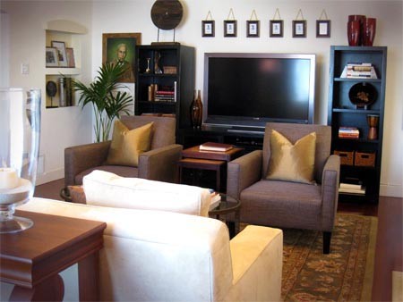
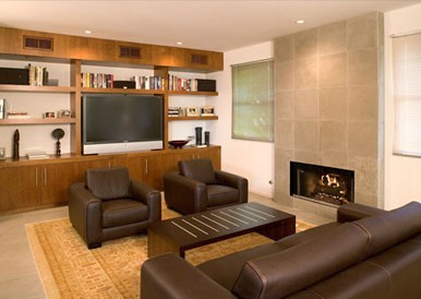
This is  my most dreaded decorating question because my answer never seems to please people.There is nothing subtle or appealing about a big black rectangle dominating a room, and that is what happens as TVs become larger. My first instinct is to come up with ways to hide the TV except when it is in use.

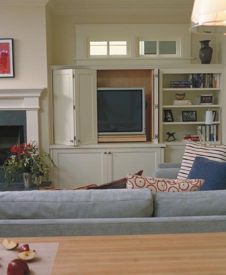
 Mahoney Architects & Interiors: More than cookies in the oven... contemporary family room


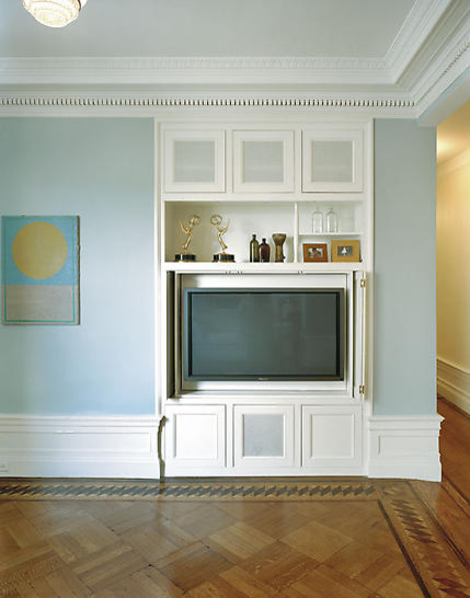
 James Wagman Architect, LLC - Apartment - Riverside Dr eclectic living room
These are  perfect solutions as far as I'm concerned.  Close the doors and the TV disappears and the room becomes more about living as a family and less about "control by the box".  


When you place a TV above the fireplace you create two black rectangular "holes" .  How attractive is that?  In a perfect world we would all have media rooms and then the TV could dominate all it wanted to, but most of us don't have the luxury of a special room for TV viewing.   

  Putting design aesthetics aside, there is an even more important consideration for TV placement that leads me to  never suggest placing it  over the fireplace -it  is just too high for sensible viewing.  When your chin is perpetually jutting up in the air, there is constant strain on your neck - it's an unnatural position.

When viewing a TV, you want to be able to look at it from a level angle, without that constant neck craning. I suggest sitting down in your chosen viewing spot and finding  the spot on the wall that is parallel to your gaze. Place a piece of tape on the wall at that point to mark where the  centre of the screen should be. You can adjust up or down between 6-12 inches without  causing discomfort. That usually means  you will need some type of  low cabinet to hold the TV and all its "stuff". Here are some suggestions for various layout problems.

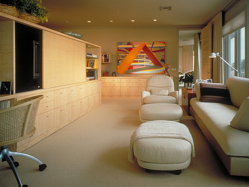
Interior Design Los Angeles | ASD Interiors contemporary living room

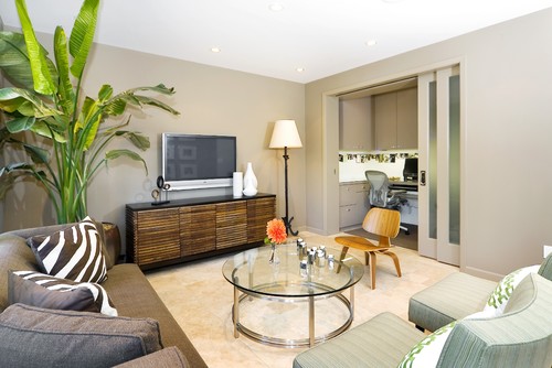
Often small rooms demand that you  be creative in your room layout to even fit in a TV.   Mounting the TV behind furniture is a good solution. If more seating is required when you have visitors, it is simple to move the two chairs around to create a more theatre style setting.

Ehrenclou Architects contemporary living room

When you have a fireplace in the room and you need to fit in a TV it is often a very difficult challenge because you often end up with competing focal points. You then have to decide what you will do to ensure one stands out more than the other. Using a darker colour or larger scale for the TV cabinet  or  using  both are good solutions. In the room above the fireplace is light and no attention is drawn to it .  The TV wall is darker and more commanding.

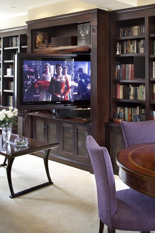
Lindy Donnelly traditional family room

 Built in cabinets  that contain a swivel shelf that allows TV viewing from various angles often solves design dilemma. This solution by designer Lindy Donnelly is a great example of a practical and sophisticated design.

La Dimora Design contemporary family room

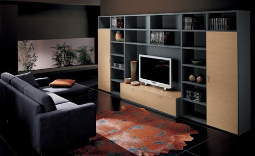
 This room is beautifully designed.   Usually TV units have the appearance of "making do" but this unit adds to/ strengthens the overall design of the room.


Amoroso Design contemporary family room

 I like the clean lines of this cabinet.  It looks like it has sliding doors which must be opened to have access to technology when the TV is on.

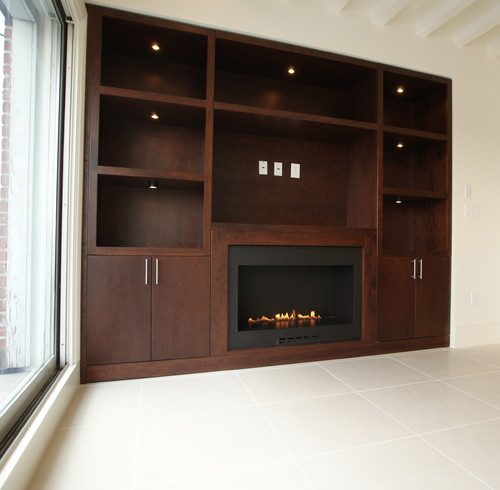
What happens when there is no other solution except putting the TV over the fireplace? If you are remodelling or doing a new home build, you have some control over the height of the fireplace. In the room depicted below the fireplace is kept low and simple and a niche was created for the TV. 


Waterfront Penthouse contemporary

Is there ever a time when a TV works over a fireplace?  I would say yes if all the seats were reclining and stylish!


10 Design Solutions for Small Bedrooms

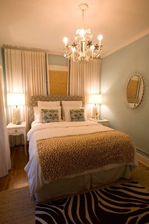
Are you wondering how to make the most of those small bedrooms you have? Sometimes it's as simple as re-arranging furniture, changing  colours or adding built- ins.  Here are 10  suggestions to make the best use of a small bedroom space, but don't stop there.   Many of these ideas can be used in other rooms too.

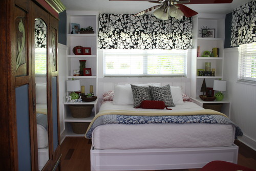
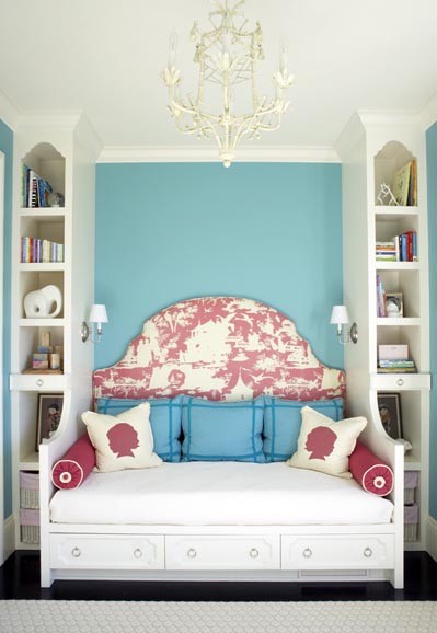
Build in around the window

Linda Fisher traditional bedroom

Using a window to centralize the layout  of the room and building in around it is an efficient use of space.  It is also very visually appealing because it produces a symmetrical layout.

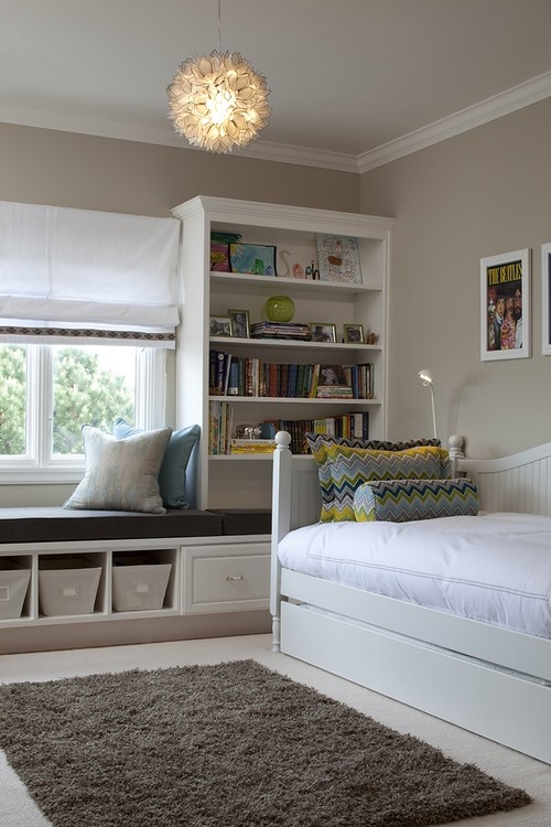
Tineke triggs contemporary bedroom

Another version of built-ins add seating space and the trundle bed provides an extra space for overnight guests. 

Symmetrical placement

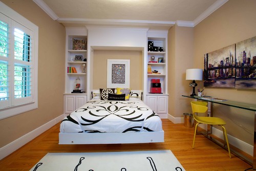
Catalano Residence eclectic bedroom
Kerrie L. Kelly

Long narrow rooms seem to be a common problem in bedrooms.  This room again uses built -ins to frame the bed thus creating extra storage space and the perfect place to highlight a piece of art. Using the length of the room for the bed enables a very symmetrical layout which allows for access to both sides of the bed. Walking in to a room and looking over the length of the bed also makes the room look longer and more spacious.

Vanessa De Vargas / Turquoise L.A.

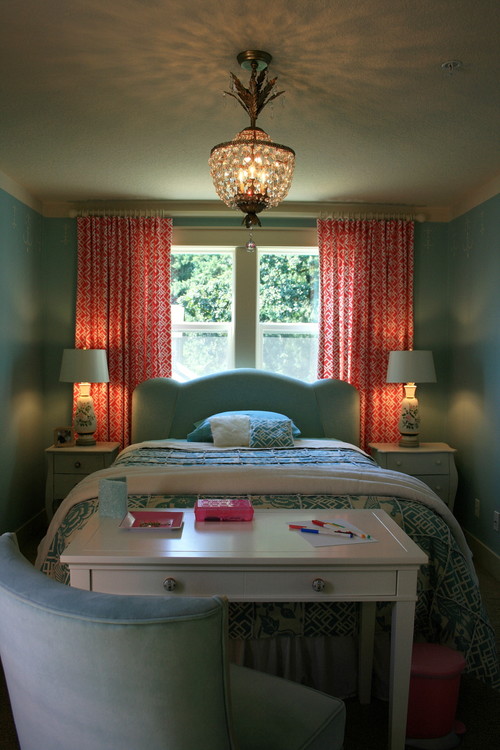
Compact and serene with one wallop of design on the floor. Do you think removing the rug would make the room look even more spacious?  I particularly love the way the small window has been made the focal point with wall to wall draperies. 

Use the walls

Guest Bedroom. eclectic bedroom

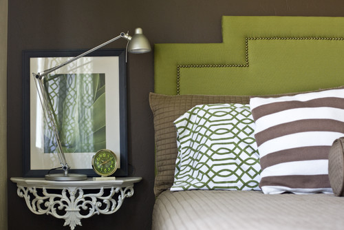
No place to put a bedside table... just hang one on the wall.  


Move furniture to the edge of the room 

The Lettered Cottage traditional bedroom

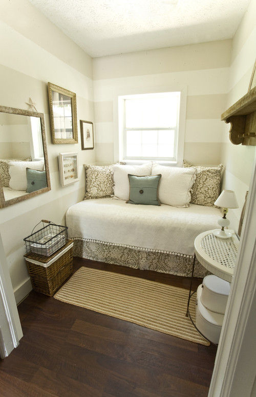
 Pushing furniture to the far edge of a room works well in some cases.  The addition of the large stripes visually expands this room.  Keeping the colours neutral with very little contrast also adds to the spacious look. This is little more than a large closet, but it is so inviting.

daybed w/shelves  bedroom

Another central layout that uses the edge of a room effectively. 

Build it up

Berg Furniture- Utica Lof contemporary kids
  allchildrensfurniture.com

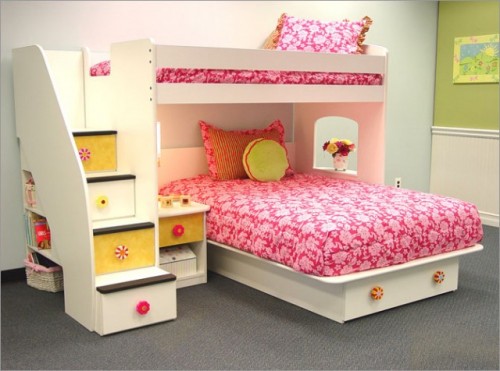
This seems to be such a safer solution than regular bunk beds.  The design also allows you to float it in the centre of the room. Lots of storage space is created as a result of the steps and centre placement.


Build it into a corner

source

Kids Bunk Room traditional kids

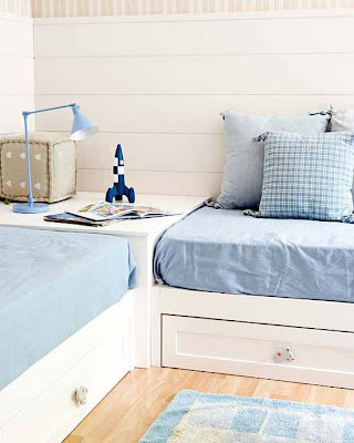
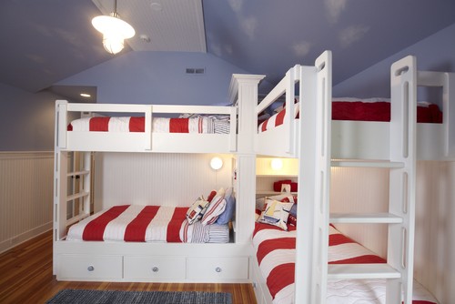
Using a corner to lay out beds is a very efficient use of space. I've seen this work effectively with two twin beds as in the photo above,  but never two bunk beds!  


Float the bed 

Closet Accessories
Lisa Adams, LA Closet Design

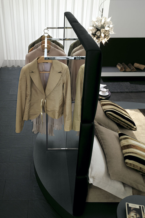
No closet space?  Don't let that stop you. Float the bed in the middle of the room  with a high headboard and install a closet system behind it. 


Use space at  the foot of the bed

Girls Dream Bedroom - No Boys Allowed eclectic bedroom
Janell Beals - Isabella & Max

This is a creative use of space for a desk. It builds on the central layout of the room and keeps everything accessible .  Benches, chairs, trunks, a small bookcase etc.  are other possibilities. 


Use glass creatively

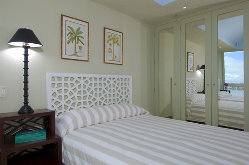
Jerry Jacobs Design: Interior Design San Francisco Bay Area tropical bedroom
A wall of glass covered closet doors expands the overall visual space of this room.  The see through headboard is another good trick.  To make the room look even larger keep all the colours light. Your eye automatically sticks on dark colours and stays there.  They have become an unwanted centre of interest.

Use furniture as a divider

This room is a fantastic  example of excellent use of space from the built- in shelves and drawers to the desk used as a divider. The large mirror also increases the visual space in the room.

Think spring green

There's nothing like the time changing to give you the feeling that spring is around the corner.  I try to have  positive thoughts this time of year, but today I'm writing with a snow storm looming in the background and announcements of St. Patrick's Day celebrations that will dwindle through the week.  What better time to explore green as a fantastic choice in home decor?

  In every home I have ever lived  there has been some version of green.  We've had our decorating go tos over the years - avocado, mint, jade, olive, silver greens, and now spring green with lots of yellow in it.  Green seems to fill our need to connect to nature.  I find it calming and vibrant at the same time.  Not many colours can have that effect. 

 
 I'd be happy with any one of these green selections in a room, but together there's a little too much predictability.  White and green is my all time favourite combination.  If I had to choose in this room it would be the roman shade and white drapery. They work to create such a fresh look. 


Fresh, fresh, fresh... I love the covered dining room chairs and how the green brings out the wood tones in the floor.  If you're wondering what is the best colour to work with any kind of wood, green is your answer - you have to find the right one. 


Think green as a sofa colour.   This room designed by Phoebe Howard  is soft and contains lots of texture to create interest starting with the grasscloth on the walls.  Botanical prints always look lovely in a room with liberal amounts of green.


Designer John Willey has masterfully combined prints to produce a very put together bedroom. Note the inclusion of the headboard colour on the banding on the Ikat patterned roman shades.  He's even taken green to the ceiling which in this design I'm not wild about .  What inspiration would you take from this room? 

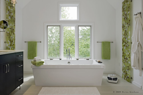
contemporary bathroom design by boston kitchen and bath Divine Kitchens LLC


Who wouldn't want to soak in this tub?  Obviously the colour scheme was taken from the scene outside the window.  The long floral panels on the adjoining wall mimic this view. I want to place a white and green rug on the floor.  

Small rooms are always a challenge to decorate and  in a regular three bedroom house, the smallest rooms tend to be used for children.  Keeping to one colour and white is always a simple but effective design solution. Using stripes on the end wall helps to expand the width of the room. 


source


And here's something a little more traditional paired with bursts of yellow. 


source 


Fresh and pristine and wonderful to curl up in.

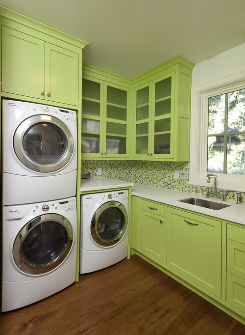
new project contemporary laundry room

Can you have too much green or too many washing machines?

Look for the bones of a room

There is nothing more boring in decor than an overly matched room!  I work in a home decor retail setting part time  and this gives me a good sense of what the "general public" is interested in or believes about home decor.  I've noticed two constant trends.  First is the belief that everything must match perfectly, and the other based on the first, is the practice of making  design decisions 12 inches from your eyes.  Both will lead you astray and create very boring rooms. The thing that really makes a difference never gets talked about.


This room could definitely be described as overly matched, but does it work ? What makes a room with such a limited palette work or not work? 

 One of the most valuable things I learned as an artist that applies to decorating decisions is the "10 foot rule ".  If you can't read a painting when standing ten feet from it, it isn't successful. The culprit is always a weak value range (not enough lights and darks) that causes everything to merge together no matter how bright or startling the colours. Squinting is another quick way to get the same information.

 The same goes for decorating. You need value changes (a range of lighter to darker colours) in a room to help create interest and variety to encourage "visual travel". Most people have no difficulty seeing colour ranges but they are not so adept thinking about the values of these colour ranges.

  If you want to know if you have a room that is visually interesting take a photo and do a black and white photocopy or change the image to black and white on your photo editor.  You'll soon see if your eyes will travel the room or stay in one spot. I believe that even in rooms where the intent is to create visual harmony, you need value changes.  Lets take a look at some successful and unsuccessful rooms. 


I choose to live in visually quiet environments because they are relaxing.  They are also the most difficult to make interesting.   Even though everything about the room above is soft, the black and white photo shows there are a range of values in the room that move your eye around.  The darks are limited but they are there in accessories mostly. The amount of white contrasts with the darks (legs, accessories on tables and don't forget the shadowing that occurs in every room.)  A light, airy and visually interesting room. My score:  quietly successful .


Lovely use of colour with soft whites, lots of variety in textures and shapes but... something is missing for me. The darkest values are in the ottoman legs.  My eyes stick there. The area in front of the window needs some anchoring darker tones to make the furniture stand out from the window. The most obvious change would be the "disappearing lamp- perhaps a new shade is in order.  Having a different pillow in the chair (the sofa pillows) or having a slightly darker value table beside the chair or doing both would move this room up several notches in interest.  Will you look at your furniture legs in a new way now?

Let check out one of my rooms...   I automatically process a room for a range of values, but I've never looked at one of my own rooms in black and white. Ready? 


Not so bad.....

There's a good range of lights, mediums and darks spread around the room. I added a darker pillow near the fireplace because I found the chair blending into the fireplace just a little too much.   I am looking for a new lamp for the spot where the twigs are in the opposite corner. I'm thinking a light shade rather than dark.  Notice how my floor has lights and darks in it too as does the roman shade which my husband loves to jam up into the window frame as much as possible.


Here's a different view with the area rug bought solely for the purpose of making the table stand out from the floor.Like much of the furniture in my home, this table is hand crafted by my husband.  I have visions of a different table but  sentiment wins every time.

Let's go back to the lovely pink and white room and check out the value ranges. Is the room successful?  You can be the judge.


Powered by Blogger.