At Home: Finishing touches for a contemporary home

Accepting a visitor/decorator into your home to deconstruct it in words and pictures is not for the faint of heart.  There's  an element of trust in this endeavour, trust that I will represent the home in a truthful and pleasing way. Knowing this, I am always so pleased when homeowners accept my proposal to highlight their home and discuss elements of their decor that I am interested in writing about.  Once again I have willing participants in my At Home series.  

Come along to see what the Erls have been up to for the last six months since they moved into their new home in the east end of St. John's, NL.


WELCOME


The entrance to this home provides a pleasing welcome with it's bold colour scheme and inviting landscaping.  As you move inside you soon realize that the exterior is an extension of the overall feel and colour schemes utilized inside. 

A neutral background


It is very obvious that Gail and Gary are  detail oriented people because  great attention is given to  both the  permanent fixtures  in their home as well as the smaller details. This is a warm home even though the majority of rooms are painted  Benjamin Moore CC40 cloud white, a tried and true warmish white.   Thankfully I don't have to try to put a positive spin on a cool white (e.g.,  Benjamin Moore decorator's white) which I am not in the least attracted to.  Thanks for making my job easier!

High contrast


high contrast black doors, black stairs, dark wood finishes


One of the most striking aspects of this home is the high contrast between the  darker wood finishes
( hardwood, doors, stairways), and the light tile, walls and windows.  The stained glass transoms created by Don Ryall were designed to parallel the one in the entry.  Two additional transoms over the entries to the kitchen carry this patterning and contrast into the centre of the house.

Vibrant accent colours


Gail has broken up the neutral framework with her love of vibrant colours liberally employed in her accents.  With each room having a different accent colour ranging from blues to orange and red you are kept interested as you move from room to room.  There is definitely an up beat feel to the space.   Knowing that Gail is a gardener, I would describe her accent colours as a garden palette.

Function and form


When you choose basic colours you can move things around to see where they look best. Gail's accessories for the most part are functional objects: pillows, clocks, baskets, vases, candles, trays, throws etc., which are easily interchanged.  While I was photographing, I had the urge to do just that to show the versatility in her collection of objects, but that might be another post. 

Use what you have

One of the struggles many people have in a move to a different style and size of home is carry over.  Often what looked great in one space, just doesn't work in another even when you keep much of the same furniture.  When I questioned Gail about this she estimated she reused about 80% of her things.  She believes  her interest in certain colours remains constant, and much of what she purchases can be used in a variety of settings.   Pillows are quickly updated with new covers, while vases, a particular favourite, alway work in a space for flowers/greenery, or to add a sculptural element to the simplest arrangement of objects.    Re-using accessories is a responsible approach to decorating, and it also provides the much needed time to find the final finishing touches.

Wood tones as a backdrop


Since the vibrancy of her accent colours are reminiscent of a riot of colourful flowers,  a range of wood tones in furniture and accessories  provide  a great foil this the bold intrusion of colour. Mixing wood tones throughout a space creates warmth and carries hints of nature throughout  a home.  While some people get carried away with efforts to perfectly match wood tones,  a more eclectic approach provides greater interest.  Choose one to dominate and be flexible with the rest.  For more on  how to integrate wood tones like a pro check out this post.

Inspiration


When asked about sources of inspiration, Gail admitted she has a  weakness for decorating magazines, and also watches  certain decorating shows.  But there is no doubt in my mind that she takes much of her inspiration from nature because it is referenced repeatedly in her home.

A good example of this is the art work over the bed in the master bedroom.  Not only does it bring us into a relaxing day by the sea it also relates to the lake that is visible through the windows.  As you can see, window treatments are minimal and frame the great views.  


European travels  have obviously had an impact on how The Erls' choose to organize and furnish their home from the single European duvets to the  clean lined aesthetic evident in every room.


The soft cream accents from the bedroom are darkened to a soft gold in the ensuite. Again, you can see nature references in the grain of the storage boxes and the content of artwork.


Seasonal decorating


If you choose the right accessories there isn't much you need to do when special events roll around. Gail and I  have the same decorating philosophy about seasonal decor!  The answer to all her seasonal decorating is colour specific to the season supported by what else - flowers and greenery.  Pop in a few orange flowers in the tray you saw in an earlier pic  and you're ready to go. That's where her vase collection comes in. She  also liberally uses fruit and vegetables in her arrangements.

Vignettes


Chuckle, chuckle... decorating speak for arranged objects.  It's the perfect word in my book, but I've gotten some strange looks from clients when I use it.   There is definitely an art to arranging objects in a pleasing way.  In essence, you are creating a 3 dimensional composition.  Check out this post for lots of tips on the various lines of design you can use when composing  arrangements.  In addition, the top three things to remember are: 1) odd numbers of objects; 2) varying heights; and 3) variety in colour and texture. Then there's: repetition, balance (symmetrical and asymmetrical) and overlapping. I see all of these elements/ principles used in Gail's arrangements.

For many people decor decisions are usually made at the  instinctual level.  Each of us is attracted to various colours, shapes/forms, textures, etc., and how  they can be organized.  Often we may not be aware of our biases.  I told Gail I would seek hers out for the post.  As you can see in the collage of kitchen shots above, she has a definite attraction to vibrant colours, repetition of form and threes.


Notice the repetition of rectangles above in the art, tray and the counter, as well as a strong vertical orientation in the vase and flowers. The curves in the apples, vase and flowers help to  counteract the straight lines.

Of course, you have to completely ignore the electrical collage behind the interesting one! Wouldn't we love a house where all the functional elements could disappear into the walls?


A fresh apple green is repeated throughout her powder room.  Here there are threes again and a strong vertical orientation in the daisy art work.  I've made my own vignette/collage and added the bottle and branches from her stairs. It really does work better on the stairs, but you get the idea about moving objects from room to room when you have accent colours that work well together.  See the hint of orange in the tissue box and the the centre of the flower.... ah, the possibilities with this green and that dark wood.

Sightlines


Sightlines are often forgotten elements in home decor.  Looking through into another room or down a hallway and having an anchoring element/focal point to tease your eye is a way of providing interest.


When you enter the foyer in the Erls' home and open the door to the living area you are greeted by this eye catching photograph of  their daughter, Karen taken by J. Reid Studios.  Not only does it provide a focal point from the entry, it continues to have a strong visual pull in the living room and dining room. 


Arranging things below such a striking piece  takes restraint because the portrait  has to shine.  You can see that the majority of  objects are darker, simple forms of varying heights.  Adding colourful things to this vignette would not have worked  half as well. The plant provides softness and connects well with the other plants/flowers in the room.   Also notice how the objects form a zig zag effect as they are arranged across the long expanse of table top - one of the best strategies for console tables. Balance is created without symmetry.


red Ikea media cabinet, Asian influences, kimono, vignette

When you walk out of the guest bedroom or up the main stairway this vignette greets you.


european duvets, striped bedding, red accent bedroom, accessories


The red is carried forward into the guest room and ....


...the orange from the kimono is used as an accent in the main bath.

There's so much more I didn't write about, but I've generously sampled the finishing touches in this home.  Thanks so much to the Erls for graciously agreeing to have us tour their home.


 Perhaps you have a favourite element or room or you  would like to share your ideas in the comments.

Accessories: A decorator's perspective

Part 2 of 5

Accessorizing a client's home

I'm often asked what is the most difficult job I do as a decorator.  Truthfully it is to accessorize a home.  Not because I can't create beautiful vignettes or select interesting objects, it's because I have a belief in individual expression in a home, and it is so difficult to feel this, and then try to create a look for someone else. The one thing I have as a decorator is an unbiased eye for someone else's space. That is helpful, and I often see new life in their discarded items.

How I do it 

With clients I spend a lot of time chatting and gathering information.  I ask them to pull out all kinds of objects they already have, even ones they think they don't want anymore, and look for things to integrate with newly purchased objects.  Check out this post to see one client's vignette.  I find out about their interests, travels, background etc.  I consider if they have children and what their interests are.  It is also worthwhile to look at children's art work for inspiration.  Another telling activity is to look at what is currently in a home and ask questions about its origins, etc.  When I ask how they want people to  feel/think when they come into their home, I usually get guidance for the overall look clients are going for.   Then I  put all the information together to come up with meaningful accessories that work for a particular  family.

inspiration board, organic, geometric, spring green
Client inspiration board - organic references 

This inspiration board was created for clients who were interested in finishing their space with additional accessories to add to objects they purchased during their travels.  When I looked at what they already had, I could see strong contrasts,  elongated textural sculptures, and several vibrant colours.  I chose an earthy green, nature references and rounder shapes to work with the more elongated ones they already had.  I wanted to warm up the predominant " blackness" of their space and play into their obvious interest in geometric motifs and texture.  With the inspiration board in hand the clients chose to shop themselves over time to complete their space.  The flowers of course never happened!  Twigs were more their style.

A long term activity

Adding the final touches to your home can take a long time.  You many have certain things in mind and can't find them; you many have budget restraints after purchasing big ticket items; you may be just plain exhausted doing everything else, and have no energy left to deal with little things. Or you can be bored with what you have and want to start over.   No matter where you are on the accessorizing continuum, you need to have a plan in place to create an interesting, personal space.

Two ways to do it

Of course the easiest way is to hire a decorator!  An inspiration board like the one above is a very affordable solution, and you can purchase all the objects referenced online, or you can use it to shop your area.  When people want to purchase locally, the inspiration board would contain objects/furniture available in the city.  Most decorators also have rates for personal shopping for clients.

If you want to do it all yourself, I suggest the following:
  • Look online (Pinterest, Houzz) and collect inspiration images looking for patterns,  objects, colours, textures that  resonate with you; look at how they are displayed/arranged;

I keep way too many files on Houzz and Pinterest to use as inspiration and reference when talking to clients about concepts. 

  • Make a list of possible items for accessorizing from your inspiration images; have headings (e.g. art, table top vignette, pillow arrangements and styles etc. )
  • Remove all the accessories in the space you are working on and put them in another room; 
  • Check your storage areas  and other rooms to see  if you have things that might have a new life in a different space;
  • Look at your collection and choose anything  that you love and think could work in the space;
  • Bring them to the room you want to accessorize and place any that work; 

I went to my own storage area to see what extras I didn't have in use. Then I integrated some of them with arrangements I already had in my dining room to show you how many things can work and be changed around.  Obviously I care about these objects or they would have made their way to charity. 

dining room vignette, Boblen vase, accessories,

 These two items on the right get used for all sorts of things.  The top is image shows a Boblen  vase that I wrote about here, and the plate is part of a set of 8 that I use for entertaining.  It also works as a candle holder or propped up on a small plate holder it becomes a graphic piece of art.

wooden vase, black candle holders, fall decorating

 The black mesh square tray was the base for a gift  I received last Christmas.  Black and square are two of my loves, when you add texture how could I let it go?  Anything hand made is alway a keeper especially when it has the beautiful form this vase does.  A few colourful berry branches the colour of the season can change the look completely.  Use your imagination about what additional seasonal objects you place in the basket/tray.

stone eggs, accessories, black candle holders, vignette

And on to the stone eggs my sister gave me years ago.  This hand crafted white  bowl has a beautiful irregular form and can be filled with all sorts of goodies. 

You get the idea.  Once you've found homes for the objects you love,  you can...

  • Make a list of what else you will need;
  • Record needs and the size/height/colour of objects; 
  • Take pictures of the areas you want to accessorize;
  • Go shopping (with your phone)! Don't forget to look in second hand stores, antique stores, dollar stores, craft studios, and on line second hand sales sites.  

Oh yes, trade with your friends and/or siblings!

Check back for Part 3 of my accessories posts where I visit a local home to explore how the owners went about adding the final touches to their new home.


Too much of a good thing


NO MORE!


The big question

Have you ever had to call a halt to buying yet another object  that you love?  When does just enough become too much? I had to confront both questions this week while I was shopping for accessories with my sister. 

Telling it like it is

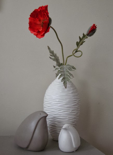
 " Oh, I love that. "  was answered with " "You don't need another one". I had to admit  then and there that I am obsessed with  birds;  circles and poppies are chasing on their heels (or feathers).   I am trying to control it, but I keep seeing so many that I love.  I'm even thinking about  a birds for next Christmas.  I already admitted that in a previous post before I realized how far I'd gone.


mid century modern birds poppy white vase
Birds,  poppy and circles- perfection in my book

Now my sister is a good one to talk!

Outdoor dining at Bonavista Social Club and listening to birds

A family thing

Vera has a bit of the same affliction and doesn't even recognize it; her focus is birds in art work. She can't pass one up without a comment. There was also a liberal smattering of birds when I featured her house at Christmas in this post.  Must be the result of growing up next to a forest.

This obsession is causing me other problems in addition to having just too many of the same thing and not enough surfaces to place them.

My granddaughter, age 2,  is suddenly sizing up her environment and putting things in the " I likka" or the  "I no likka" category.  Birds are in the "I no likka " camp!   What do I do about that?   If exposure is going to make her more comfortable with our fine feathered friends she's in the right house. Since most of my birds are highly stylized it took her awhile to notice they were birds, but she's on to me now.

Bird sightings 

I like to  think that I place the products of my  obsession artistically by  weaving  them into vignettes and moving them from room to room so they aren't in one space too long.

mercury bird vignette living room books coffee table
Sitting proudly in the knowledge he was the first 
kubus 4  mercury bird living room table
Not so happy with the " I no likka birds" title
Look closely.  There are two birds. Oh my!

autumn vignette tray mercury bird fall flowers
 At home in autumn finery 
mercury bird vignette dining room
His latest home on the dining room table
white stylized bird on shelf
Bird sighting in the family room
Yes, they get around. But some are stationary. 


hummingbird key hook

There's the  hummingbird key hook, 


filigree bird with wreath

and the filigree bird hanging in my wreath thanks to my friend who also likes birds.  Yes, it all adds up.


Kubus4 blackbird red pot vignette
Black bird
 My latest acquisition and hopefully my last. Thanks Target. But will it be my last?

You can always dream

Eames house bird shelf
Source 

But...... this is the one I dream about and will probably never have (unless the lotto comes my way or my relatives decide on a group gift). I'd pitch that Target bird in a heartbeat.

Please tell me that you too have an object obsession~!  Time to own up. 

Design Love: Kubus

One of my favourite Scandinavian designers is Danish architect Mogens Lassen (1901-1987).  I am now the proud owner of one of his designs - Kubus 4.  Thank you family; I've had a love affair with this candleholder for years. 

Kubus 4 Lassen accessories
Kubus 4 candleholder in my living room
 I've begun to think up all the things I can do with this beauty, as well as  sizing up the various spots that are crying out for its presence. Its colour and bold form is not easily ignored.  I love the large space in the cube beneath the candles because it allows you to add additional objects to create lovely vignettes. Right now I have my bird bowl by local potter, Erin McArthur.

Kubus 4 adventh wreath
 Idea for next year- advent wreath
 
by Lassen is a family business whose simple mission is to carry the Lassen legacy forward - because good design lives on through new generations. Here are some of the products available today.

Kubus 8, Kubus 4 and Kubus bowl


Kubus 1 has its own design potential

Kubus bowl in beige 


Kubus white with flowers Klassen
Kubus in white with mounded roses
  source
The Kubus Bowl was inspired by the Kubus 4 candleholder. This design is available in several colours, and the design potential is limitless.  You can add a range of things to it:  snacks, plants, flowers, ornaments etc.and/or add new elements under it to create a vignette. Of course it is a beautiful sculpture all on its own. 
kubus 4 copper vignette Lassen
Kubus 4 vignette
source
If you want to have a little Kubus treasure hunt check out  my  recent post on  Scandinavian Design  Elements.  There's one hiding.


Accessories: Making it all work

 Decorators get all kinds of requests for services from furniture layout to full home designs. I like the variety of smaller jobs with  the ones that go on forever.  Two of my favourite tasks are rehanging art to best advantage and providing the last layer of accessories in a home. Sometimes I get to do both in the same house!

Over the next several posts I want to provide a glimpse into the thought processes I use when accessorizing a client's space.   Think about it as adding the icing to an already great cake. If you do it for your own home or as a professional service, the task is really the same. You have to juggle design principles with individual taste (both decorator& clients) and existing elements in the home.

 Sometimes homeowners have  objects  to incorporate in the design and other times you may  start with a clean slate.   As a decorator, I find  a  clean slate  more difficult  because I want to choose accessories that are "sensible" for the homeowner.  By that I mean  I want to select objects that relate to  family composition, budget, existing objects  and  interests.   Here's a little of how it goes.....

Use what is important to you

Re-use objects from other rooms

Mix shapes and scale

accessories: Making it all work

 This is a perfect example of  how existing objects  can  form the backbone of a great vignette.  The crystal vase was a wedding gift and  the lamp was in another room, but the scale was too small for that space. The homeowners had the mirror from their previous home.  When I saw the silver cut edged design in the frame that  mimicked the cuts in the crystal, I knew it would work.  I have to admit I am a firm believer in giving  new life to "previously loved" things.

There is  variety  in the  shapes in this vignette.  The major objects (table and mirror) are rectangles,  the bottle, vase and lamp are cylinders, the ceramic bowl a softened square.   Spheres are introduced in the top of the bottle and the floral shapes.  The leaves serve to soften all the shapes with their lovely droop.

 Have a mix of warm and cool tones


The homeowner wanted something to put keys in so the soft white ceramic bowl with a  coppery/bronze interior was chosen.  If everything is silver why add  warm tones ?  I like to mix metals for interest.  The jar behind  the bowl is mercury glass and it has a bronzy metal top- both work with the warm tones in the orchids.   So three cool tones and three warm tones.   I always mix warm and cool. 

Choose an accent colour from other objects or art

Move the accent colour around the vignette and the  larger space 

 Pay attention to the geometry in a space


Move  colours around the vignette.  This is a must for success.  When you have a mirror and a small space you can depend on what is on the opposite wall to add to your vignette.   You can see glimpses of  the opposite side of the porch  in the mirror. 

Choosing an accent colour
All the walls on the main floor are a cool blue gray.  You already know I like to mix warms and cools in any scheme, so I wanted a warm colour to offset the cools.   The first thing I chose for this room was the art. The pillow was second. The art was chosen based on what I observed hung in the home on my first visit. Two of the pieces had orange as a primary colour and both had elements of  landscape in them.  This is a more interpretative landscape which is also usually  a safe purchase.  The lines of design in the painting  bring the viewer in an up thus adding depth and height to this small space. it works well with the scale of the bench and the the nine foot ceiling.

I couldn't pass up the repetition of the back shape of the bench in the pillow.  It serves to break up the dark in this small space and moves your eye around.  I also love how the diamonds duplicate the linear quality of the trees but in a more complicated way.

 Choose items that can work in several formations


 If you choose your objects wisely you can move them around and add seasonal items to the decor when needed. And most importantly of all do not get over stressed when things mysteriously get bumped or shoved off centre as the table in the above shot!  People live there.   


And that is why homeowners call a decorator!

Thoughts on decorating coffee tables

Now you may be surprised  to discover that some people  (especially decorators) put a lot of thought into turning a coffee table into a work of art!


   I frequently admire the sometimes over the top arrangements (vignettes or tablescapes to decorators) found in many decorating magazines and online portfolios, but they rarely seem practical to me.  First and foremost, a coffee table is a functional item that provides a place to lay  drinks, nibbles etc., but  I do agree that it is a flat expansive surface that calls out for some adornment.   How far you want to go with this adornment is up to you. 

Thoughts on decorating coffee tables Designing Home
Margaret Ryall

This is the most I have ever had on a coffee table and there was still lots of room for drinks and cheese. My ceramic  bird finds various homes around the house. You never know where he  might pop up.  Books are always great props if you don't go overboard. They provide  height, colour and text as design elements.  

Everyone should have one great bowl .  Mine is from IKEA and it can always be found on my coffee table. Sometimes it has a vase of flowers added, 
 

 or Christmas ornaments  or gourds,  ... you get the idea.  So a great looking bowl of some sort is a very practical solution that you can keep changing.  I like silver  and low because everything looks great with it. 


Here are some other great bowls....


Ceramic vases especially white ones are also great additions for every decor.  I particularly like small ginger jars or fret work jars. 


Mixing metals is very in right now and having a gold or copper bowl really warms up a space.  When you have a large coffee table you need an equally large bowl to keep the scale working. This is a very  "masculine" look.  Consider small globes, gears, wooden sculpture, carved boxes, magnifying glass, etc. for masculine additions.

 The ultimate bowl coffee table combination :) from Phillips Collection.


Next....

Margaret Ryall 

is the versatile tray.   When you arrange objects in a tray and you want more space you simply lift it off the table.  This is a very simple fall arrangement on my coffee table/bench in  my family room.  Note Mr. Bird has moved rooms. The paper bag ceramic vase in grayish white is another of my staples.  It gets filled with all kinds of things from twigs to candles.


Three candle holders of varying heights are very versatile for  your decorating needs. You can change the colour of the candles for seasonal events. Natural elements like coral and flowers always add texture and a little of the outside world.  Think about starfish, shells, ferns, twigs, grasses, etc.as natural complements to glass and ceramic. Heights and textures add interest and move the eye around.


Very simple and effective selection of objects in white and black. I like the fact the tray is wood which instantly warms up the collection.  A sphere of some sort is also a versatile object to own.  One with texture is even better.

And don't forget plants...


...with a little sculpture thrown in.  I have been looking for something sculptural to add to my small collection, but nothing has appeared yet.

Hope you found some ideas for your space.....
Powered by Blogger.